How Do You Produce a Tone in Art? Simple Guide
Learn how do you produce a tone in art with this simple guide covering shading techniques, value scales, and practical tips for beginners.
Ever stared at a painting and wondered why it just feels right? Chances are, the artist nailed something called tone. It's one of those things that separates a flat, lifeless sketch from a piece that practically jumps off the canvas. And here's the good news: you don't need years of art school to figure it out.
When people ask, "How do you produce a tone in art?" they're really getting at the heart of what makes visual work compelling. Tone is all about the lightness or darkness of colors and shapes, and it controls everything from depth to emotion. Without it, your drawings look like coloring book pages. With it, they breathe.
This guide is going to walk you through the nuts and bolts of creating tone in your artwork. Whether you're picking up a pencil for the first time or you've been doodling for years but can't quite crack the code, you'll find practical advice that actually works. We'll cover shading methods, value scales, color relationships, and a whole lot more. So grab your sketchbook, and let's dive in.
What Exactly Is Tone in Art?
Before we get into the how, let's nail down the what. Tone refers to the relative lightness or darkness within an artwork. Think of it this way: if you took a photograph of your painting and converted it to black and white, the range of grays you'd see represents your tonal range.
It's not the same thing as color, though people mix those up all the time. You could have two completely different colors that share the exact same tone. A bright red and a medium green might look worlds apart, but squint your eyes and they could appear equally dark. That's tone at work.
Artists sometimes call it "value," and honestly, the terms get tossed around interchangeably. The important thing to remember is that tone creates the illusion of three dimensions on a flat surface. It tells the viewer where the light source is, what's close and what's far away, and what kind of mood the whole piece carries.
Why Tone Matters More Than You Think
Here's the deal. You could have the most gorgeous color palette in the world, but if your tonal values are off, the painting falls apart. It's like baking a cake with fantastic frosting but forgetting the eggs. The structure just isn't there.
Tone does several heavy-lifting jobs in any artwork. First, it creates form. A circle is just a flat shape until you add gradual shifts from light to dark, and suddenly it becomes a sphere. Second, tone establishes depth. Lighter tones tend to push things forward while darker ones make elements recede into the background. Third, and this is where things get really interesting, tone sets the emotional atmosphere of your work. A painting dominated by dark tones feels mysterious, dramatic, or even threatening. Flip that to mostly light tones, and everything feels airy, hopeful, and calm.
Professional artists know this instinctively. They plan their tonal composition before they ever touch a brush to canvas. If you want your work to have that same professional quality, understanding tone is non-negotiable.
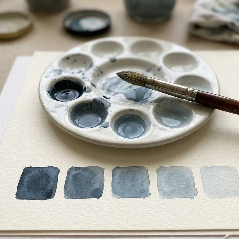
How Do You Produce a Tone in Art? Simple Guide to the Value Scale
Let's get practical. The first tool you need in your tonal toolkit is the value scale. Picture a strip that goes from pure white on one end to pitch black on the other, with smooth gradations of gray in between. Most artists work with a scale that has somewhere between five and ten distinct steps.
Here's a straightforward way to build your own value scale:
Start with a row of small boxes on your paper. Five boxes works great for beginners, though you can bump it up to nine or ten as you get more comfortable. Leave the first box white. Fill the last box with the darkest dark your medium can produce. Now fill in the middle boxes with evenly spaced grays. The center box should be a perfect middle gray, right between your lightest and darkest values.
This exercise sounds simple, and it is. But it's also incredibly revealing. Most beginners discover that they're working in a very narrow tonal range, usually sticking to the middle grays and avoiding the extremes. Once you see that tendency on paper, you can start pushing yourself to use the full range. That's where the magic happens.
Practice this with every medium you use. Pencil, charcoal, paint, digital tools. Each one handles tonal transitions differently, and getting comfortable with those differences will make you a far more versatile artist.
Shading Techniques That Build Beautiful Tone
Now that you've got your value scale down, it's time to talk about how you actually apply tone to your artwork. There are several tried-and-true shading techniques, and each one gives you a slightly different look and feel.
Hatching and Cross-Hatching
This is probably the most classic shading method out there. Hatching involves drawing parallel lines close together. The closer the lines, the darker the tone appears. Cross-hatching takes it a step further by layering sets of lines at different angles on top of each other. It's a fantastic technique for pen and ink work, and it gives your drawings a textured, handcrafted quality that smooth shading just can't replicate.
The trick with hatching is consistency. Keep your lines confident and evenly spaced. Wobbly, hesitant marks create a messy look rather than controlled tone. And don't be afraid to build up layers gradually. Three or four passes of light hatching will give you richer darks than one heavy-handed attempt.
Blending and Smooth Shading
If hatching is all about visible marks, blending goes the opposite direction. With this technique, you're aiming for seamless transitions between tonal values. Pencil artists often use blending stumps or even tissue paper to smooth out their graphite. Painters achieve this through wet-on-wet techniques or careful brushwork.
Smooth shading works beautifully for realistic portraits, still life studies, and anything where you want a polished, photographic feel. The key is patience. Build up your tones in thin layers, blending as you go. Rushing this process almost always results in muddy, overworked areas that you can't fix easily.
Stippling
Here's one for the patient folks. Stippling creates tone entirely through dots. More dots packed closely together produce darker areas, while widely spaced dots create lighter values. It's time-consuming, no doubt about it, but the results can be stunning. Stippled artwork has a luminous quality because the white of the paper shows through between every single dot.
This technique works exceptionally well with fine-tipped pens and is popular in scientific illustration and tattoo design. If you've got the patience for it, stippling teaches you incredible control over tonal gradation.
Scumbling
Scumbling involves making small, circular, overlapping marks. Think of it as controlled scribbling. The density of your circles determines the tone. It's a great technique for creating organic textures like foliage, clouds, or rough surfaces, and it works well with both dry and wet media.

Understanding Light and Shadow for Better Tone
You can't produce convincing tone without understanding how light behaves. Every object lit by a single light source displays a predictable pattern of tonal areas. Learning to see and replicate these areas is one of the biggest breakthroughs you'll have as an artist.
When light hits a rounded object like a sphere, you'll notice several distinct zones. The highlight sits where light strikes most directly, and it's your lightest value. Moving away from the highlight, you enter the mid-tone area, which represents the object's actual local color under normal lighting. The core shadow appears where the surface turns away from the light completely, and this is typically the darkest area on the object itself.
But it doesn't stop there. Below the object, you'll see a cast shadow stretching across the surface it's sitting on. And between the core shadow and the cast shadow, there's often a subtle band of reflected light bouncing back up from the ground surface. This reflected light is dimmer than the mid-tones but lighter than the core shadow, and including it in your work adds a tremendous sense of realism.
Getting these relationships right takes observation. Set up a simple still life with a single lamp and a white ball, and just study it. Draw it over and over. You'll start seeing these tonal zones everywhere, on faces, on buildings, on fruit sitting in a bowl on your kitchen counter.
Working With Tone in Color
So far, we've mostly talked about tone in terms of black, white, and gray. But tone applies to color work too, and this is where a lot of artists stumble.
Every color has an inherent tonal value. Yellow, for instance, is naturally a light-valued color. Deep violet is naturally dark. The challenge comes when you need to lighten or darken a color while keeping it vibrant and alive.
Adding white to lighten a color (creating a tint) works, but it can make colors look chalky if you overdo it. Adding black to darken a color (creating a shade) often turns things muddy and dull. Experienced painters get around this by mixing in complementary colors or by reaching for darker or lighter versions of related hues instead of just adding black or white.
Here's a practical tip that'll save you a lot of frustration: squint at your work regularly. Squinting blurs the details and lets you see the big tonal relationships. If everything looks like the same mid-range value when you squint, you need to push your lights lighter and your darks darker. It's a simple habit, but it's incredibly effective.
Another approach is to photograph your work in progress and convert the photo to grayscale on your phone. This strips away the distraction of color and shows you exactly where your tonal values stand. Many professional artists rely on this trick daily.
How Do You Produce a Tone in Art? Simple Guide to Common Mistakes
Knowing what to do is only half the battle. Knowing what not to do saves you just as much time. Here are some of the most common tonal mistakes beginners make, along with how to fix them.
A narrow value range is probably the biggest issue. New artists tend to cluster all their values in the middle of the scale, avoiding both the very lights and the very darks. The result looks washed out and flat. Push yourself to include at least one area of near-white and one area of near-black in every piece. That contrast is what gives artwork its punch.
Another frequent problem is placing highlights and shadows inconsistently. If your light source is coming from the upper left, every object in the scene needs to follow that same logic. A misplaced highlight is like a wrong note in a song. It might not be obvious to everyone, but something feels off.
Over-blending is another trap. When you blend everything into smooth, seamless transitions, you lose the energy and character of your marks. Some edges should be hard and crisp. Others should be soft and gradual. Varying your edge quality adds life and visual interest to your tonal work.
Finally, watch out for making outlines too prominent. Heavy outlines flatten your forms and fight against the three-dimensional illusion that good tone creates. As you develop your tonal range, you'll find that you need outlines less and less. The contrast between light and shadow defines the edges of your forms far more naturally than any drawn line ever could.
Practical Exercises to Strengthen Your Tonal Skills
Theory is great, but nothing beats hands-on practice. Here are some exercises that will sharpen your ability to produce tone effectively.
Try doing a full drawing using only three values: light, medium, and dark. This forces you to simplify and make clear decisions about your tonal structure. It's harder than it sounds, and it teaches you a lot about composition and clarity.
Next, set up a simple still life and draw it multiple times using different shading techniques. Do one version with hatching, one with smooth blending, one with stippling. Comparing the results side by side shows you the strengths and personality of each approach.
Also, practice copying master artworks in grayscale. Pick a painting you admire and recreate just the tonal structure, ignoring color entirely. This trains your eye to see value relationships the way experienced artists do.
One more exercise worth trying is the sphere study. Draw a sphere every day for a week, each time with a different light source direction. Top left, direct front, below, behind. This builds your understanding of how light direction affects the entire tonal pattern, and that knowledge transfers directly to drawing anything from faces to landscapes.
Digital Tools and Tone Production
If you're working digitally, you've got some extra advantages when it comes to tone. Most drawing programs include eyedropper tools that let you check the exact value of any area in your work. Adjustment layers let you tweak the overall tonal balance without touching your original marks. And grayscale modes let you work out your values before introducing color.
A popular digital workflow starts with a grayscale underpainting. You block in all your values first, making sure the tonal structure is solid and readable. Then you add color on top using overlay or color blending modes. This method virtually guarantees that your values work, because you've already sorted them out before color enters the equation.
Whether you prefer traditional or digital media, the principles stay the same. Light, shadow, and the full value scale are universal concepts that apply to every artistic medium and style.
Conclusion
Producing tone in art comes down to understanding how light and dark values interact across your composition. From hatching to blending, from value scales to light source analysis, mastering tone transforms flat images into compelling, dimensional artwork. The "How Do You Produce a Tone in Art? Simple Guide" laid out here gives you a clear starting point. Keep practicing those exercises, study the masters, and remember that great tonal work doesn't happen overnight. Stay patient, stay curious, and watch your art come alive.
Read next: 15 Cool Art Ideas to Spark Creativity and Inspiration
Frequently Asked Questions
Q1.What is the difference between tone and color in artwork?
A: Tone refers to lightness or darkness, while color describes the hue like red or blue.
Q2.Can beginners learn to produce tone in art quickly?
A: Yes, practicing value scales and simple shading exercises builds tonal skills within a few weeks.
Q3.Which shading technique is best for realistic artwork?
A: Smooth blending works best for realism because it creates seamless transitions between light and shadow.
Q4.How does the value scale help improve artwork tone?
A: It trains your eye to see and use the full range from white to black.
Q5.Do digital artists need to understand traditional tonal techniques?
A: Absolutely, because traditional tonal principles apply identically to all digital painting and illustration work.
Stay up to date with our latest ideas!