15 Background Drawing Ideas to Enhance Your Art
Transform your artwork with creative background drawing ideas that add depth, emotion, and professional polish to every piece you create.
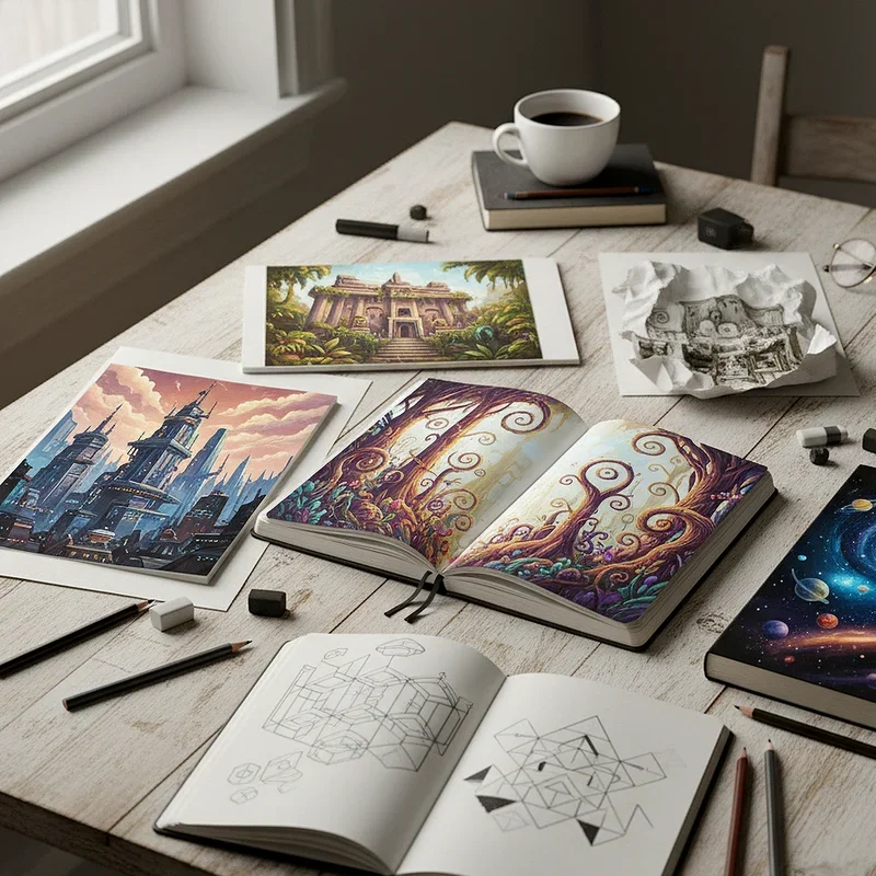
Have you ever completed a beautiful character sketch only to feel something's missing? You're not alone in this artistic dilemma. The background of your artwork serves as the stage where your main subject performs, and without it, even the most stunning foreground elements can feel incomplete. Think of backgrounds as the supporting actors in a movie—they might not always steal the spotlight, but they make the entire production believable and engaging. Whether you're a beginner exploring different styles or an experienced artist looking to refresh your approach, mastering background techniques will elevate your art to new dimensions. This guide walks you through fifteen creative background drawing ideas that will breathe life into your compositions, add context to your subjects, and help you develop a more polished, professional style that captivates viewers from the first glance.
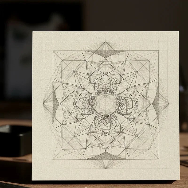
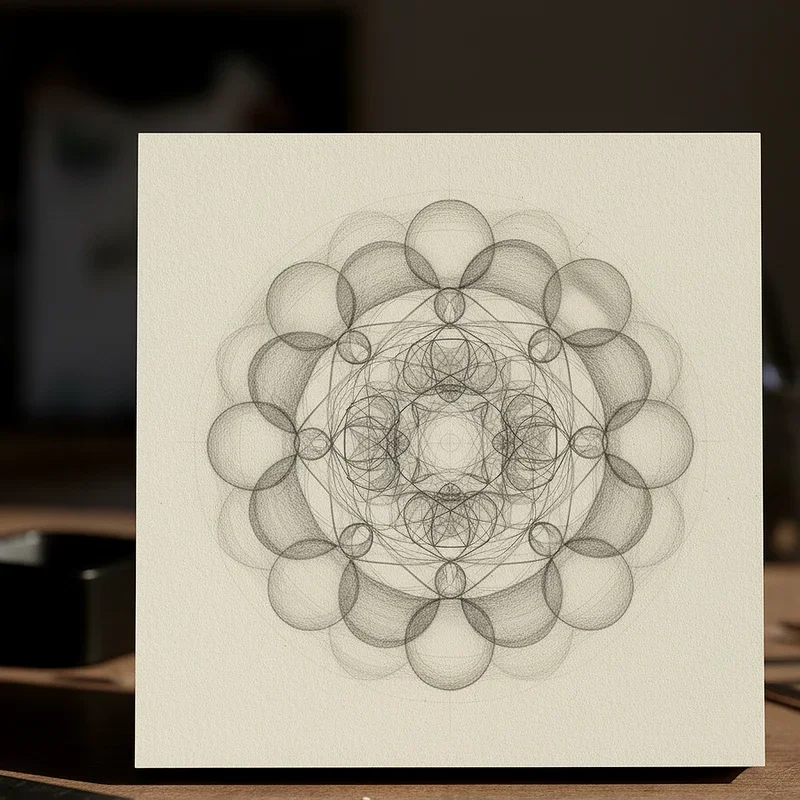
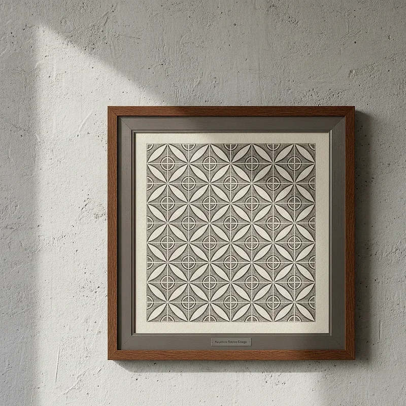
1. Abstract Geometric Patterns
Abstract geometric patterns inject modern energy into your artwork without overwhelming your main subject. You can create triangles, circles, squares, or hexagons that overlap and intersect, forming visually interesting compositions behind your focal point. These shapes work particularly well with contemporary character designs or product illustrations where you want a clean, professional appearance. Consider using complementary colors to make your subject pop while maintaining visual harmony throughout the piece. The beauty of geometric backgrounds lies in their versatility—you can adjust the complexity based on your skill level and the mood you're conveying. Start with simple shapes and gradually layer them to build depth and sophistication in your artwork.
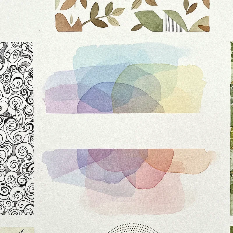
2. Soft Gradient Washes
Soft gradient washes provide a gentle transition of colors that creates atmosphere without demanding attention from your main subject. This technique involves blending two or more colors seamlessly, moving from light to dark or shifting between complementary hues that enhance your overall composition. Gradients work wonderfully for portraits, fantasy illustrations, and emotional pieces where you want to establish mood through subtle color psychology. You can apply gradients horizontally, vertically, or radially depending on where you want to guide the viewer's eye. The soft nature of this background style makes it incredibly forgiving for beginners while offering endless creative possibilities for advanced artists seeking that perfect atmospheric quality.
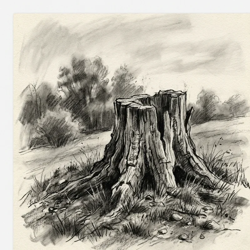
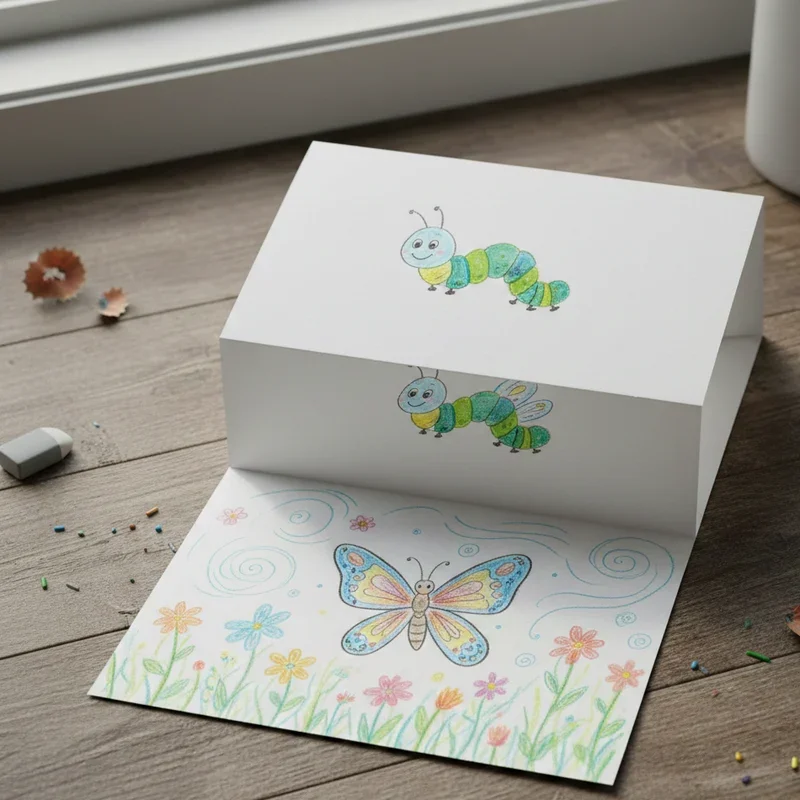
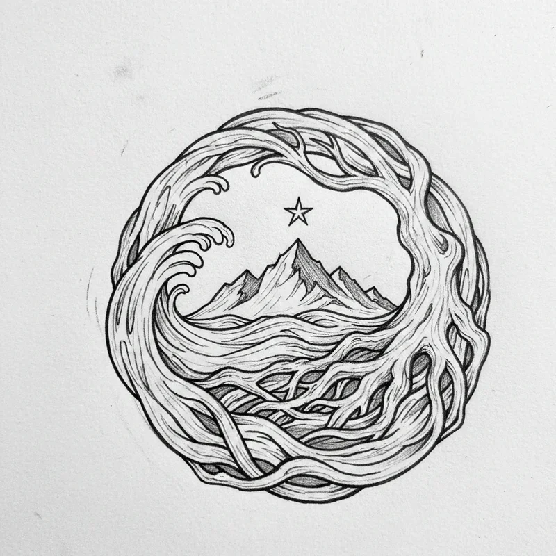
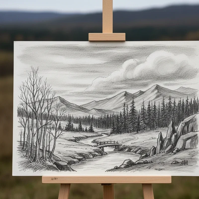
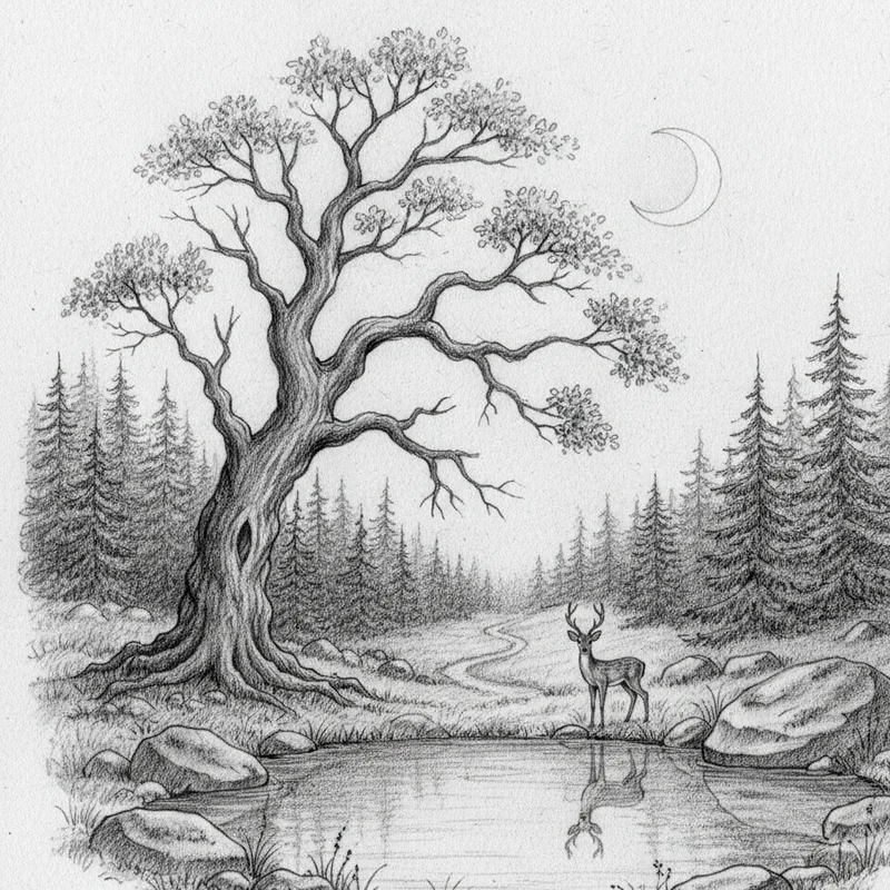
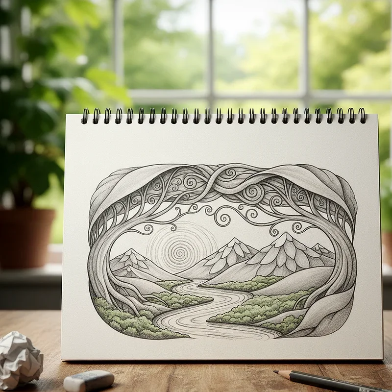
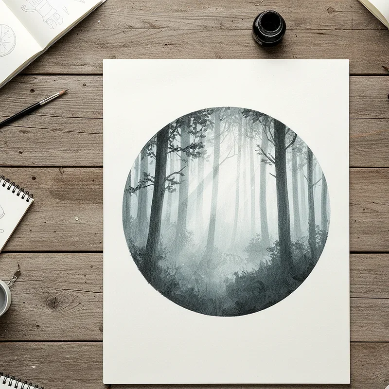
3. Nature-Inspired Landscapes
Nature-inspired landscapes anchor your subjects in recognizable environments that viewers can connect with emotionally and visually. Whether you're sketching rolling hills, dense forests, or peaceful meadows, natural settings provide context that tells a story about your character or object. These backgrounds don't need to be hyper-realistic—simplified silhouettes of mountains or stylized trees can be equally effective in establishing your scene. Consider the relationship between your subject and the environment: does the landscape complement their personality, create contrast, or add symbolic meaning? Natural backgrounds also offer opportunities to practice perspective, atmospheric effects, and the interplay of light and shadow across different terrain types.
4. Atmospheric Perspective Scenes
Atmospheric perspective scenes utilize the principle that objects appear lighter, less detailed, and bluer as they recede into the distance. This technique creates incredible depth in your artwork, making flat drawings feel three-dimensional and expansive. You'll achieve this effect by gradually reducing contrast, softening edges, and shifting colors toward cooler tones as elements move toward the horizon line. This background approach works exceptionally well for epic fantasy scenes, outdoor portraits, and any composition where you want to emphasize scale or distance. The technique mimics how our eyes naturally perceive depth in the real world, making your artwork feel more authentic and immersive to viewers.
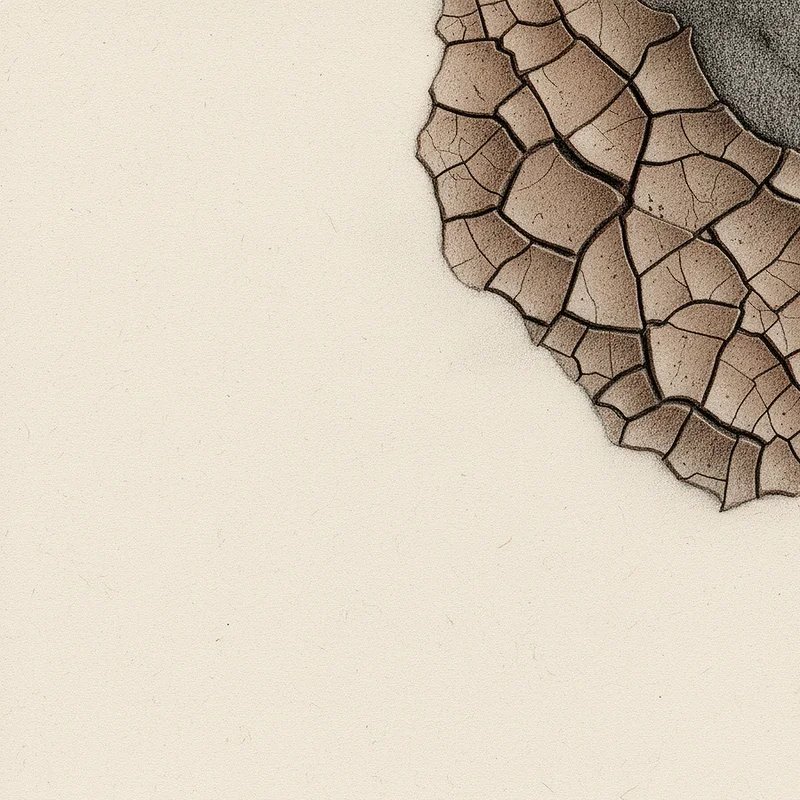
5. Textured Surface Treatments
Textured surface treatments add tactile quality to your backgrounds, making them feel rich and dimensional rather than flat and lifeless. You can create texture through various methods: crosshatching, stippling, scumbling, or even incorporating actual textures through mixed media techniques. These textured backgrounds work beautifully for adding visual interest without introducing specific recognizable elements that might distract from your subject. Consider how different textures evoke different feelings—rough textures might suggest age or ruggedness, while smooth textures feel modern and clean. Experiment with layering multiple texture techniques to build complexity and depth that gives your artwork a professional, finished appearance that stands out.
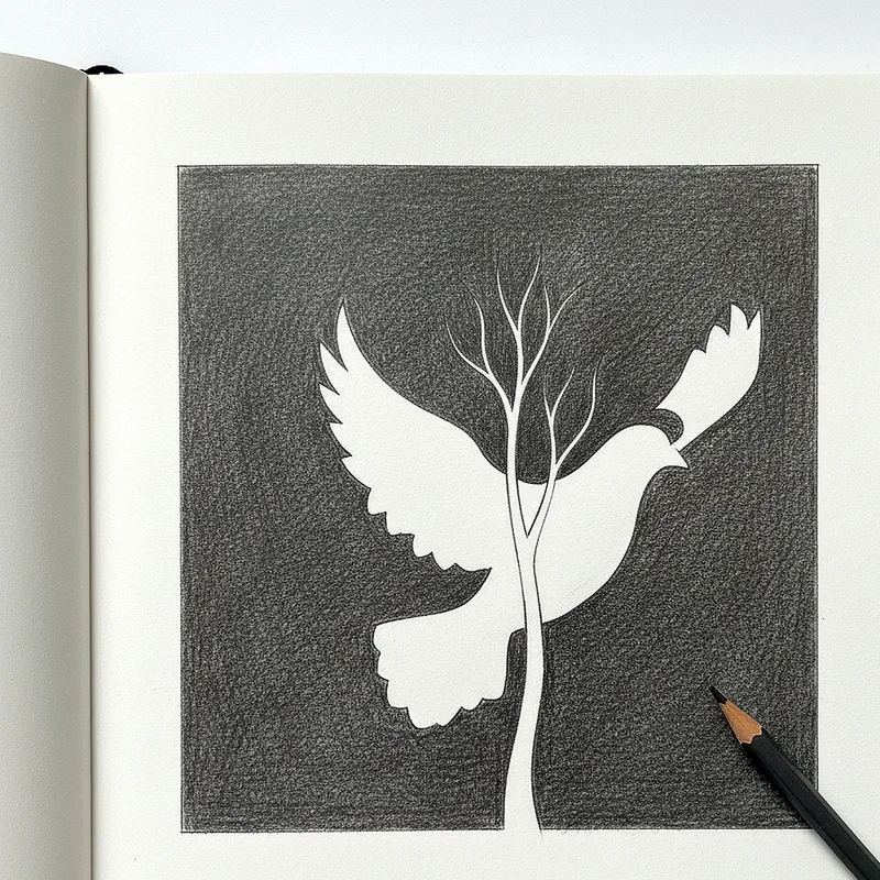
6. Minimalist Negative Space
Minimalist negative space backgrounds embrace the philosophy that less is more, allowing your subject to command absolute attention. This approach uses empty or nearly empty backgrounds, often with just a subtle color wash or simple gradient to prevent starkness. Negative space works particularly well for commercial illustrations, logo designs, and pieces where clarity and impact are priorities over atmospheric storytelling. The key to successful minimalist backgrounds lies in choosing the right amount of emptiness—too much can feel unfinished, while too little defeats the purpose. This style demonstrates confidence in your work, trusting that your subject is strong enough to stand alone without elaborate environmental support.
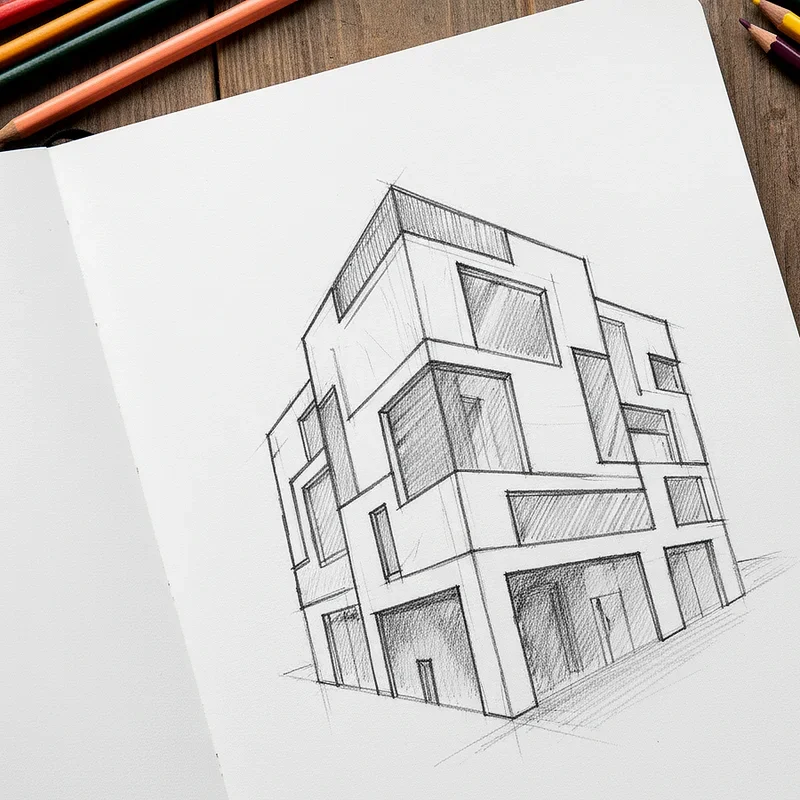
7. Urban Architectural Elements
Urban architectural elements bring contemporary edge and storytelling potential to your artwork through buildings, streets, and cityscapes. You don't need to draw every brick and window—simplified architectural forms like building silhouettes, fire escapes, or street signs can effectively establish an urban setting. These backgrounds work wonderfully for character designs set in modern contexts, comic book illustrations, or any piece where you want to convey energy and human civilization. Consider using perspective techniques to create depth, making buildings recede into the distance or tower dramatically above your subject. Urban backgrounds also offer excellent opportunities to play with artificial lighting, reflections, and the contrast between organic subjects and geometric structures.
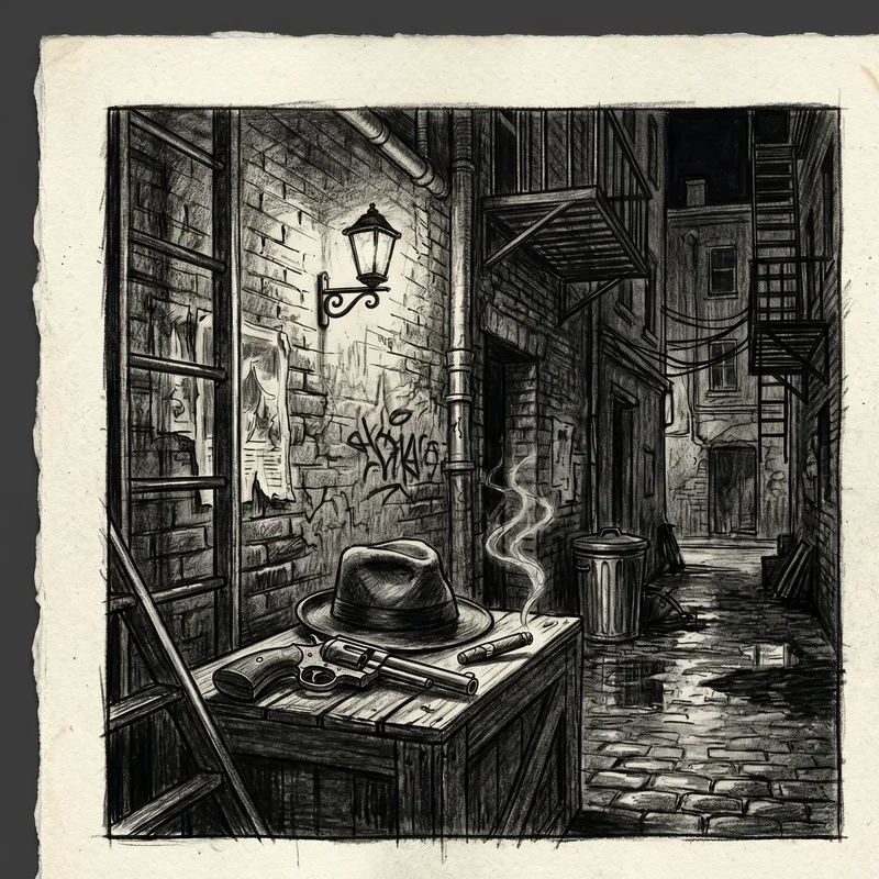
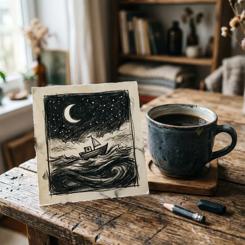
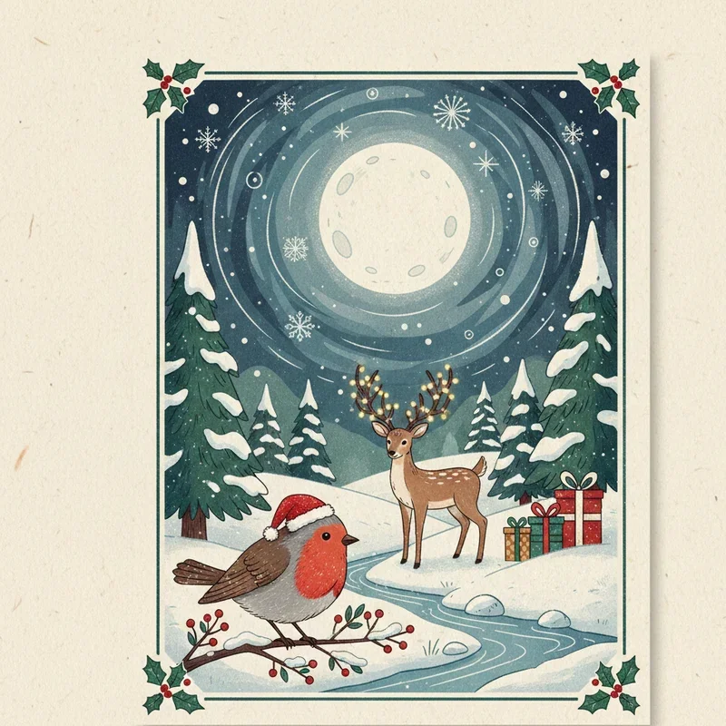
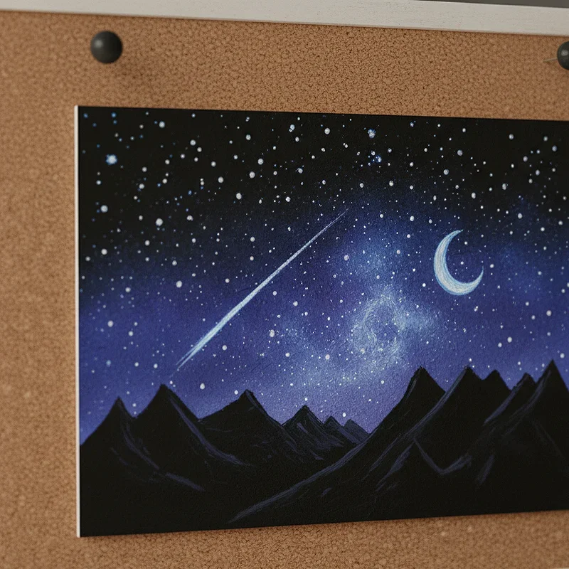
8. Starry Night Skies
Starry night skies create magical, dreamy atmospheres that transport viewers into ethereal worlds beyond everyday reality. This background style involves scattering points of light across a dark gradient, perhaps adding a moon, clouds, or even nebula-like color washes for added drama. Night skies work beautifully for fantasy illustrations, romantic scenes, or any artwork where you want to evoke wonder and contemplation. You can vary the intensity of your stars, using brighter points for closer stars and dimmer ones for distant galaxies, adding depth to even this distant background element. The darkness of night skies also provides excellent contrast for lighter subjects, making them stand out dramatically.
9. Bokeh Light Effects
Bokeh light effects mimic the beautiful out-of-focus light circles created by camera lenses, adding a photographic quality to your drawings. This technique involves creating soft, circular light spots in various sizes scattered across your background, typically over a blurred or gradient base. Bokeh backgrounds feel contemporary and romantic, working especially well for portraits, celebrations, or urban night scenes where artificial lights would naturally appear. You can control the mood by adjusting the colors of your bokeh—warm yellows and oranges feel cozy, while cool blues and purples create a more mysterious atmosphere. This background style impressively bridges the gap between traditional drawing and photography-inspired illustration.
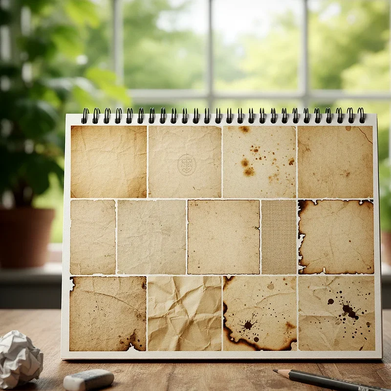
10. Vintage Paper Textures
Vintage paper textures give your artwork an aged, nostalgic quality that suggests history and timelessness beyond the actual creation date. This background approach involves creating the appearance of yellowed, stained, or weathered paper through subtle color variations, spots, creases, and edge distressing. These backgrounds work exceptionally well for historical illustrations, steampunk designs, or any piece where you want to evoke a sense of the past. You can achieve paper textures through various techniques: light washes of tea-colored tones, strategic erasing, or actual coffee staining if you're working traditionally. The subtle imperfections inherent in vintage paper backgrounds add character without overwhelming your main subject matter.
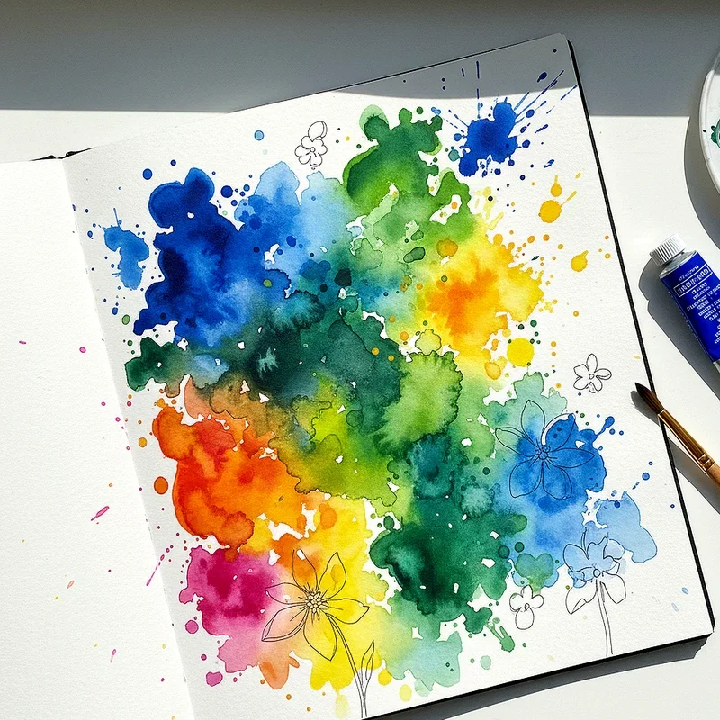
11. Watercolor Splash Backgrounds
Watercolor splash backgrounds introduce organic fluidity and spontaneous energy that contrasts beautifully with more controlled foreground subjects. This technique involves creating loose, flowing color applications that suggest watercolor paintings, with colors bleeding into each other and creating natural variations. These backgrounds work wonderfully for expressive portraits, nature illustrations, or any artwork where you want to convey emotion and movement. The unpredictable nature of watercolor effects means each background becomes unique, adding originality to your work. You can create these effects traditionally with actual watercolors or simulate them digitally, adjusting the intensity and color palette to match your specific artistic vision and complement your subject.
12. Repetitive Pattern Designs
Repetitive pattern designs create rhythmic visual interest through regularly spaced motifs that fill your background space with decorative appeal. These patterns might include flowers, geometric shapes, cultural symbols, or abstract forms repeated across the entire background area. Pattern backgrounds work particularly well for fashion illustrations, decorative portraits, or pieces with a folk art or textile-inspired aesthetic. The key to successful pattern backgrounds lies in choosing appropriate scale—patterns too large or too bold will compete with your subject, while those too small might read as texture rather than distinct pattern. Consider using colors that harmonize with your subject while maintaining enough contrast for both elements to remain visually distinct.
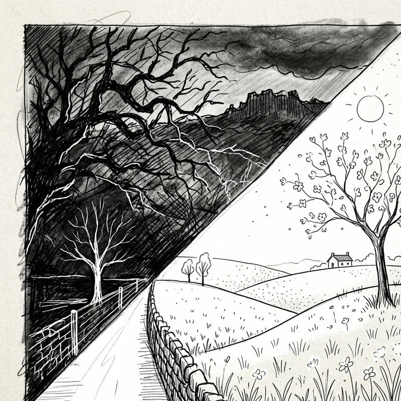
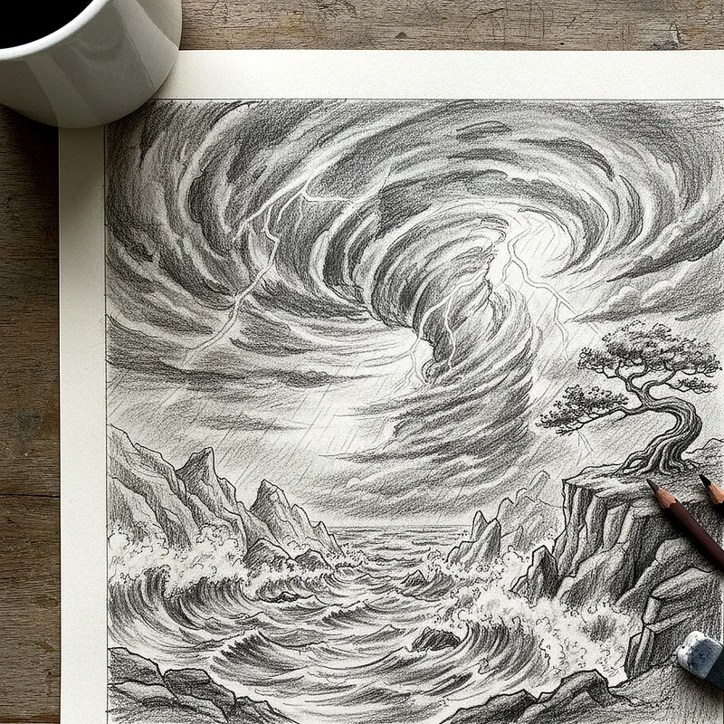
13. Dramatic Weather Conditions
Dramatic weather conditions add narrative tension and emotional depth by placing your subjects in environments actively affected by natural forces. Rain, snow, fog, wind, or storms create dynamic backgrounds that suggest movement, challenge, or atmospheric mood beyond static settings. These backgrounds require attention to how weather interacts with your subject—rain creates streaks and wet surfaces, snow accumulates and softens forms, fog obscures and creates mystery. Weather backgrounds work brilliantly for storytelling illustrations, emotional portraits, or action scenes where environmental challenges enhance the narrative. The movement inherent in weather also provides natural directional lines that can guide the viewer's eye through your composition strategically.
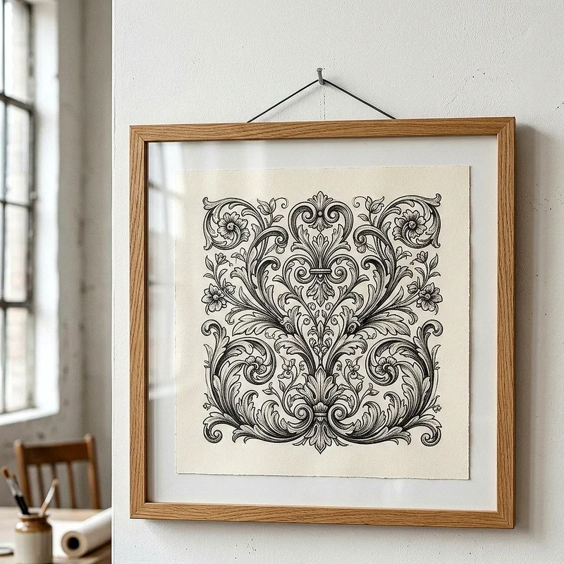
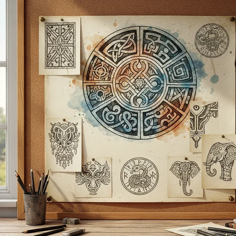
14. Cultural Motif Integration
Cultural motif integration incorporates traditional design elements from specific cultures, adding symbolic meaning and visual richness to your backgrounds. These motifs might include Celtic knotwork, Japanese wave patterns, African geometric designs, or indigenous tribal elements that connect your artwork to cultural heritage. When using cultural motifs, approach them with respect and understanding, ensuring your incorporation honors rather than appropriates these meaningful symbols. These backgrounds work beautifully for character designs rooted in specific cultural contexts, fantasy worlds inspired by real traditions, or pieces celebrating cultural diversity. The intricate nature of many cultural patterns adds sophistication and demonstrates your willingness to research and incorporate meaningful details.
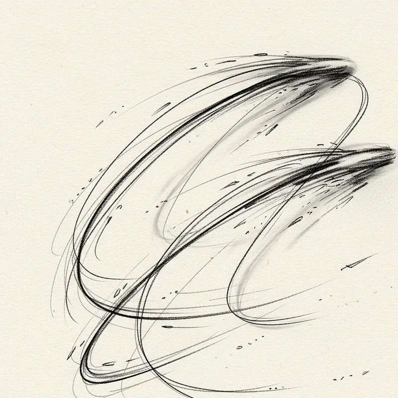
15. Dynamic Action Lines
Dynamic action lines create visual energy and movement through directional marks radiating from or swirling around your subject. These lines suggest motion, impact, or dramatic transformation, making static images feel alive with kinetic energy. Action lines work particularly well for comic book illustrations, superhero art, sports drawings, or any piece where you want to emphasize speed or power. You can vary the intensity by adjusting line thickness, spacing, and direction to control how much energy your background conveys. This technique draws from manga and comic traditions, bringing graphic novel aesthetics to your work while maintaining focus on your central subject through strategic line placement and density variation.
Conclusion
Backgrounds transform your artwork from isolated subjects into complete visual stories that engage viewers on multiple levels. Each of the fifteen ideas we've explored offers unique advantages for different artistic goals, moods, and skill levels. Remember that backgrounds should enhance rather than compete with your main subject, serving as the perfect frame that makes your focal point shine. Don't be afraid to experiment by combining multiple techniques—perhaps geometric patterns with gradient washes, or nature landscapes with dramatic weather. Your background choices reveal as much about your artistic voice as your rendering techniques. Start incorporating these ideas into your practice today, and watch how quickly your artwork develops that professional, polished quality that captivates audiences and elevates your creative expression.
Read next: 15 Art Drawing Ideas to Spark Creativity
Frequently Asked Questions
Q1. What is the easiest background drawing technique for beginners?
A: Soft gradient washes are most beginner-friendly, requiring simple color blending without complex details or technical skills.
Q2. How do I choose the right background for my artwork?
A: Consider your subject's mood, story, and colors, then select backgrounds that complement without overwhelming the focal point.
Q3. Can I combine multiple background techniques in one drawing?
A: Absolutely! Layering techniques like textures with gradients or patterns with atmospheric perspective creates unique, sophisticated backgrounds.
Q4. Do backgrounds need to be realistic or detailed?
A: Not necessarily—simplified or stylized backgrounds often work better, maintaining focus on your subject while adding context.
Q5. How much time should I spend on backgrounds versus subjects?
A: Generally spend 30-40% of your time on backgrounds, ensuring they're complete without overshadowing your main subject.
Stay up to date with our latest ideas!