15 Contrast Drawing Ideas to Improve Your Art Skills
Master 15 powerful contrast drawing ideas that transform flat artwork into dynamic compositions. Elevate your art skills today!
What separates forgettable artwork from pieces that stop viewers in their tracks and demand attention? The answer often lies in contrast, that magical principle where opposites collide to create visual tension, depth, and undeniable impact across your compositions. Think of contrast as the volume knob for your artwork: without it, everything plays at the same flat level, but with strategic application, certain elements scream while others whisper in perfect harmony. Whether you work in pencil, charcoal, ink, or digital mediums, understanding contrast transforms amateur sketches into professional-quality drawings that communicate with power and clarity. This fundamental principle extends far beyond simple light and dark values into texture, size, detail, and even conceptual oppositions that enrich your artistic vocabulary. Ready to discover fifteen contrast-focused drawing exercises that will revolutionize how you approach every future artwork? Your journey toward more dynamic, engaging art begins right here.
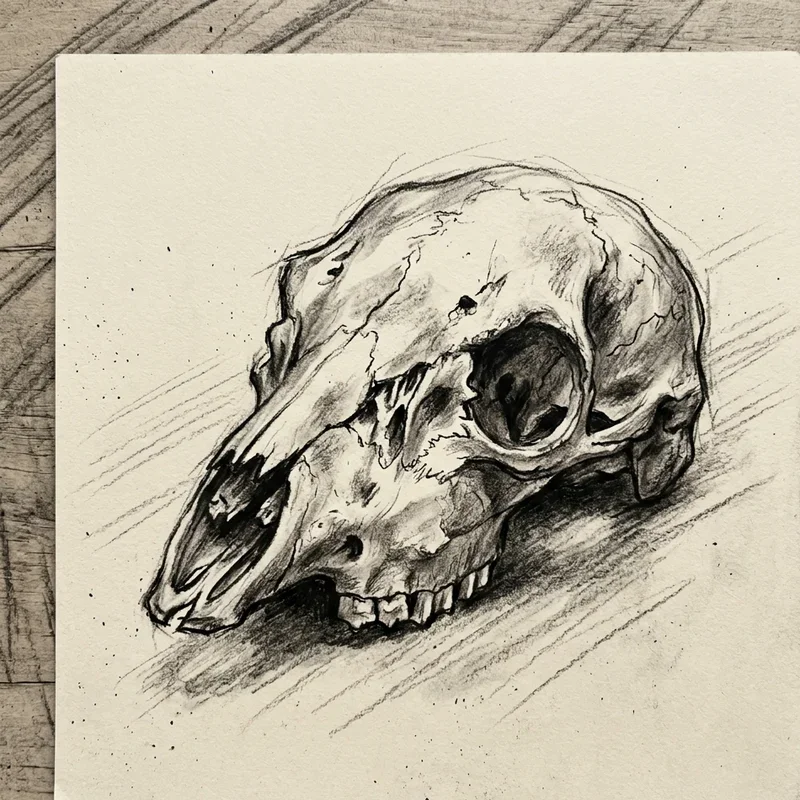
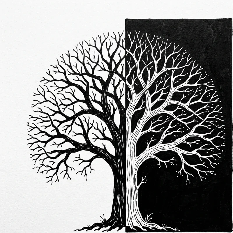
1. Light and Shadow Value Study
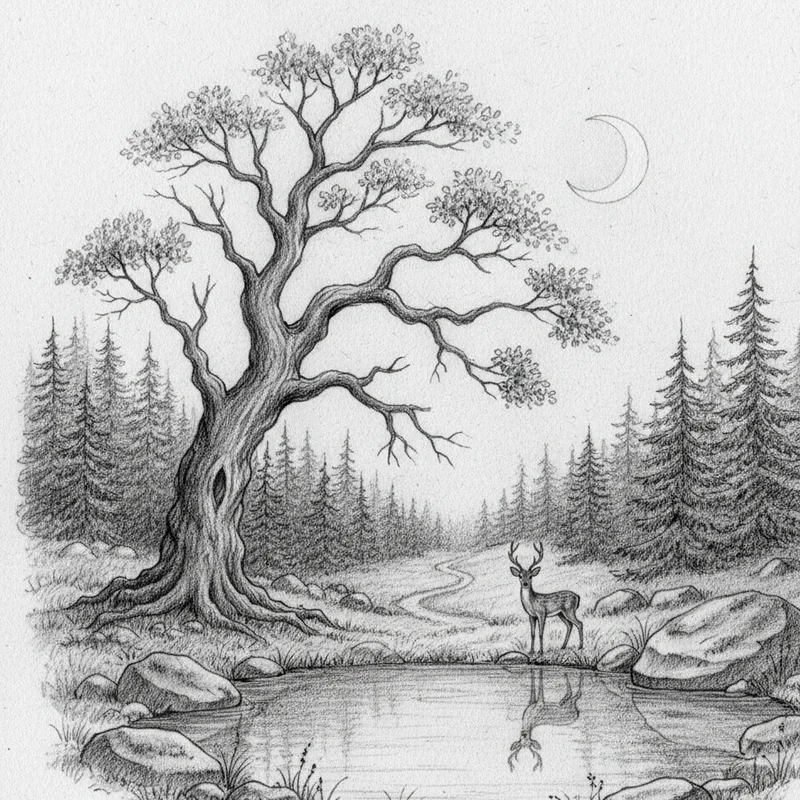
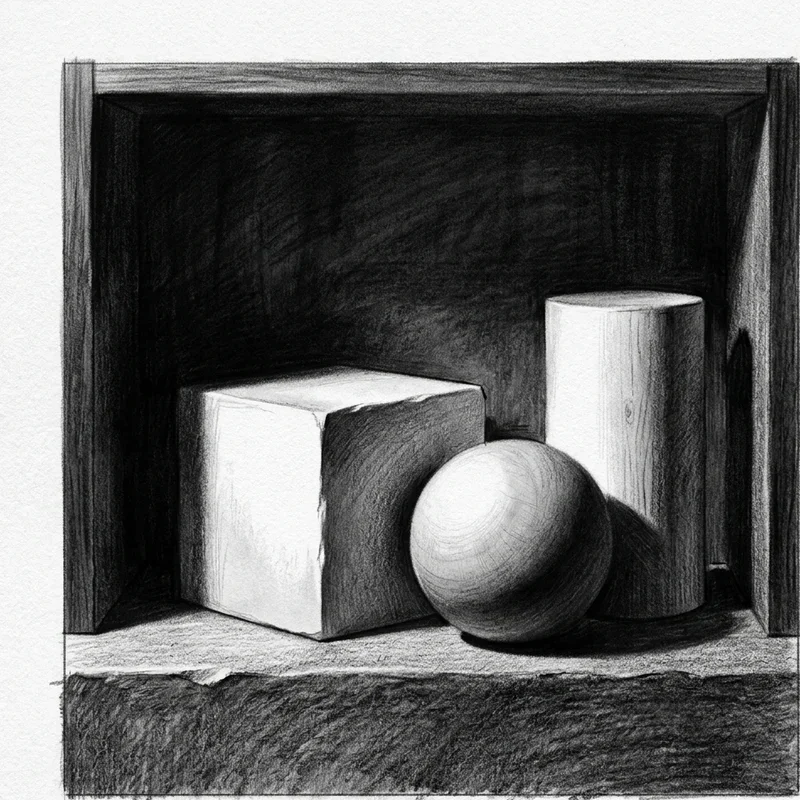
Begin your contrast journey with the most fundamental opposition in visual art: the dramatic dance between light and shadow across forms. Value contrast creates the illusion of three-dimensionality on flat surfaces, transforming simple shapes into convincing objects that seem to exist in actual space. Set up a still life with a single strong light source, then draw the extreme lights and darks you observe while ignoring middle values initially. This exercise trains your eyes to see value relationships rather than simply outlines of objects you already recognize conceptually. Push your darkest darks to pure black and preserve your lightest lights as paper white for maximum impact across compositions. The discipline of limiting your value range to extremes before reintroducing middle tones develops sensitivity to subtle value shifts that distinguish masterful drawings from flat amateur work. Your value studies become foundations upon which all other contrast principles build naturally.
2. Texture Contrast Exploration
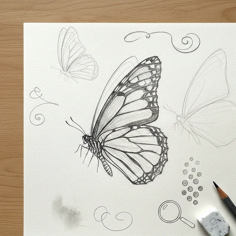
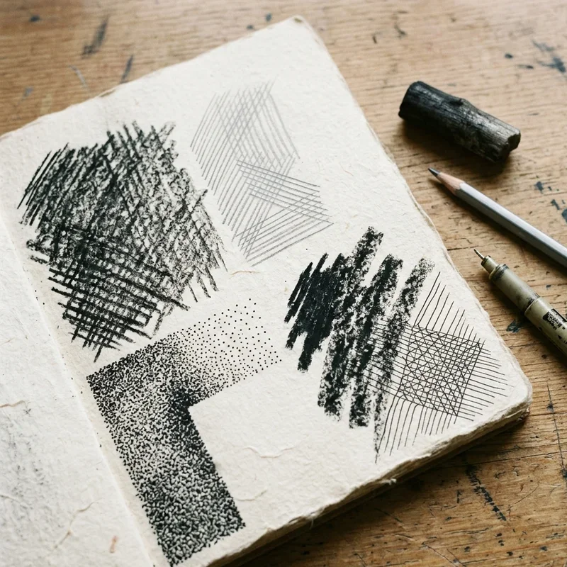
Create drawings that juxtapose radically different textures within single compositions, forcing your hand and mind to develop techniques for rendering varied surfaces convincingly. Pair smooth glass beside rough bark, sleek metal against weathered stone, or soft fabric touching prickly cactus for texture studies that challenge your mark-making vocabulary. Each texture demands different techniques: smooth surfaces need gradual value transitions while rough textures require broken marks, stippling, or energetic line work throughout. The contrast between textures creates visual interest that uniform surfaces cannot achieve regardless of their individual quality. Train yourself to analyze textures systematically: what makes velvet look different from sandpaper when reduced to pencil marks on paper? This exercise expands your technical repertoire while developing observation skills that transfer to every future drawing project. Your texture contrast drawings become reference libraries for techniques applicable across countless subjects.
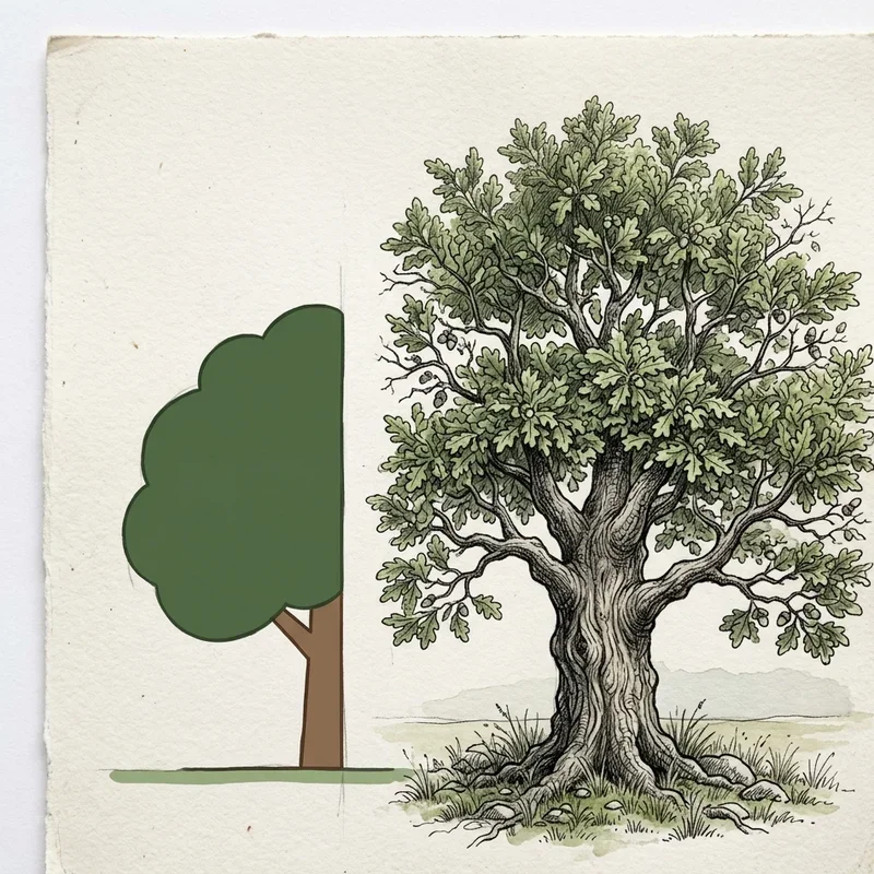
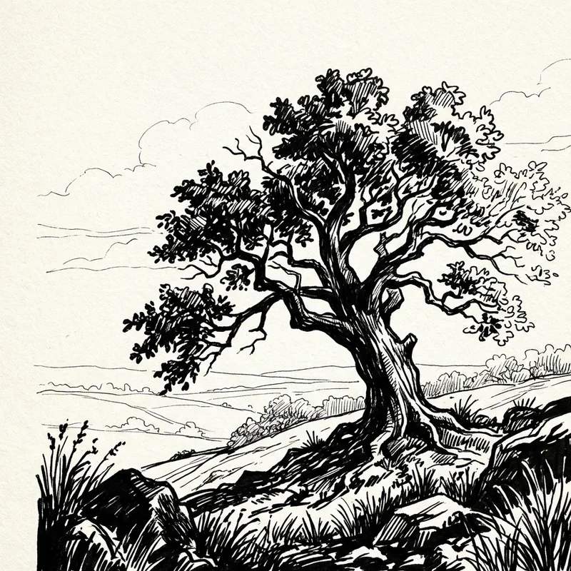
3. Scale and Size Opposition
Play with dramatic scale relationships where enormous elements dwarf tiny companions within the same compositional space. Draw a massive tree beside a minuscule figure, or a giant eye reflecting a tiny landscape within its pupil for scale contrasts that create immediate visual interest. Scale contrast creates narrative tension and emotional impact: the relationship between large and small suggests power dynamics, vulnerability, or wonder that evenly-scaled compositions cannot communicate similarly. This exercise challenges your ability to maintain proportional accuracy across dramatically different sizes while composing balanced arrangements despite unequal visual weights. Consider how negative space around small elements balances the mass of larger forms to achieve compositional equilibrium throughout. The skill of managing scale relationships proves essential for illustration, concept art, and storytelling through visual means. Your scale contrast drawings teach principles applicable whenever compositions require visual hierarchy establishment.
4. Detailed vs Simplified Areas
Develop compositions where hyperdetailed focal areas sit beside deliberately simplified or even abstract supporting regions strategically. This contrast guides viewer attention precisely where you intend, using detail density as a spotlight illuminating important elements selectively. Draw a face with every eyelash rendered while surrounding it with loose, gestural hair and clothing that merely suggests form without describing it fully. The eye naturally gravitates toward complexity, making detailed areas automatic focal points regardless of their position within compositions. This exercise teaches restraint: knowing when to stop adding detail proves as important as knowing how to render intricate surfaces convincingly. Artists often overwork entire drawings to the same finish level, creating visual monotony that exhausts viewers scanning for rest areas unavailingly. Your detail contrast drawings demonstrate sophisticated compositional thinking that distinguishes professional work from amateur efforts immediately.
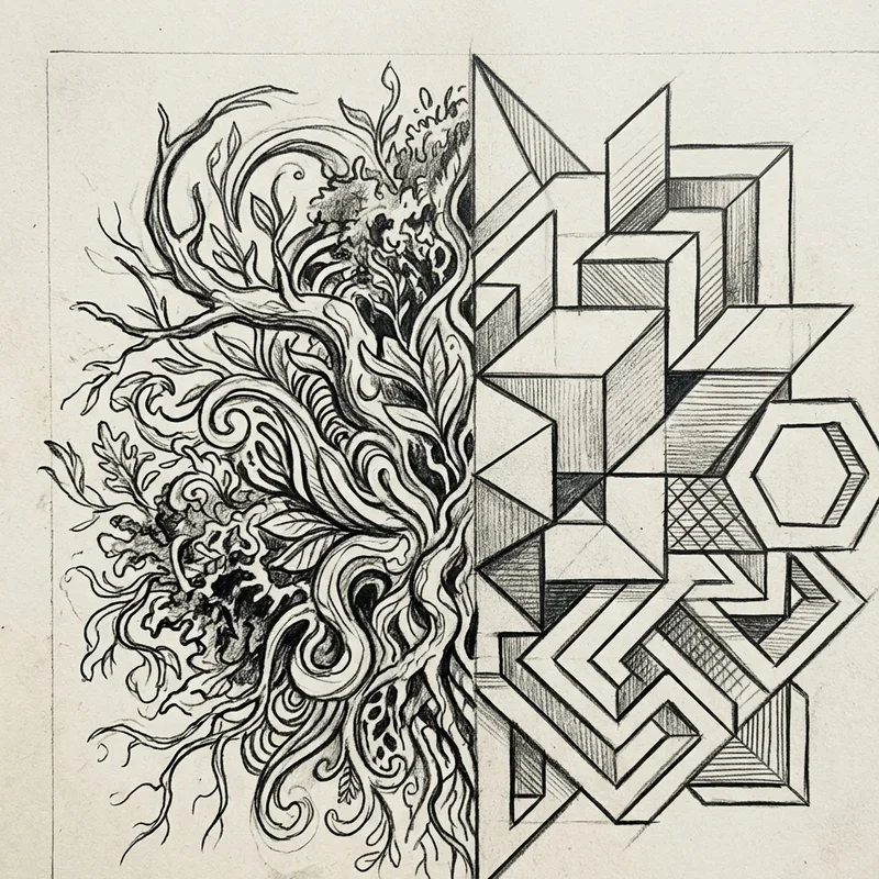
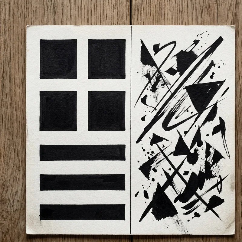
5. Organic and Geometric Shapes
Create tension between flowing organic forms and rigid geometric structures within unified compositions that celebrate their fundamental differences. Nature rarely produces perfect circles, straight lines, or precise angles, while human constructions frequently embrace geometric precision that contrasts sharply against natural chaos beautifully. Draw trees growing through abandoned buildings, flowers arranged in geometric vases, or animals inhabiting architectural spaces for organic-geometric contrasts that feel inherently interesting. The opposition between these shape languages creates visual tension that neither alone can generate independently. This exercise develops your ability to render both shape types convincingly while composing arrangements that maximize their contrasting qualities effectively. Consider how curves soften rigid geometry while straight lines anchor flowing organic forms within compositions. Your organic-geometric drawings explore fundamental visual language differences that inform countless artistic decisions moving forward.
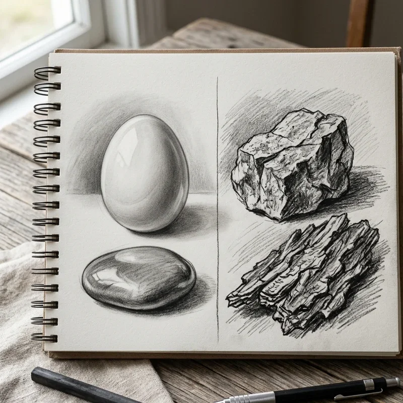
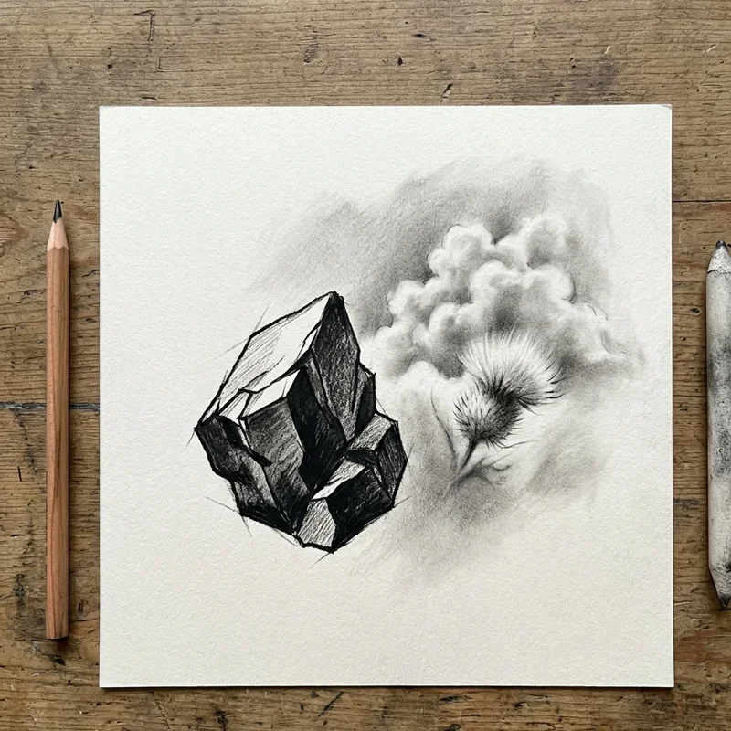
6. Smooth and Rough Surface Drawing
Render smooth surfaces directly beside rough ones, developing techniques for each while maximizing the contrast between their fundamental textural qualities. A polished apple beside a woven basket, or calm water reflecting rough cliffs, offers opportunities for surface contrast that elevates both elements through opposition. Smooth surfaces require controlled gradations, careful blending, and clean transitions that suggest uninterrupted continuity across forms. Rough surfaces demand broken marks, varied pressure, and deliberately inconsistent application that suggests physical irregularity convincingly. The technical challenge of rendering both surface types within single drawings expands your mark-making vocabulary considerably. This exercise trains your hand to switch between controlled precision and deliberate looseness as compositions require different qualities in different areas. Your smooth-rough contrast drawings demonstrate technical versatility that communicates confidence and skill to viewers immediately.
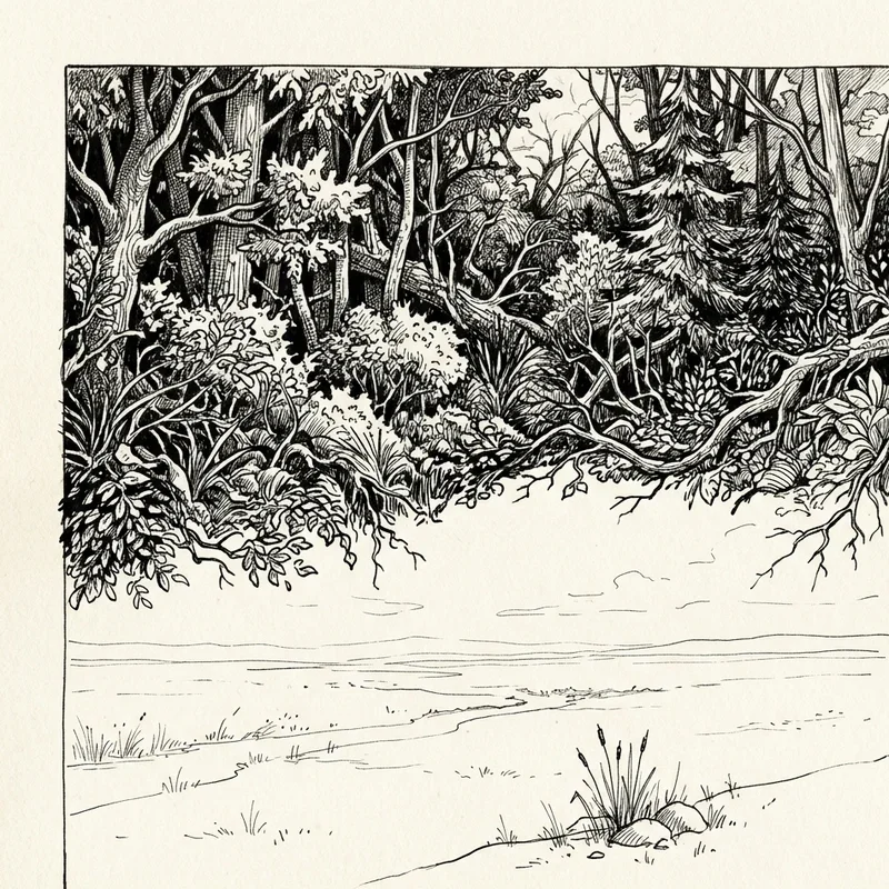
7. Positive and Negative Space
Explore the relationship between objects (positive space) and the areas surrounding them (negative space) through drawings that treat both with equal importance and intention. Strong negative space shapes prove as carefully designed as positive forms, creating compositions where emptiness actively contributes rather than passively existing. Draw subjects where negative space shapes become as recognizable as positive forms: the space between chair legs, gaps between branches, or silhouettes against complex backgrounds. This exercise trains you to see and compose what isn't there as deliberately as what visibly occupies space. Many artists neglect negative space, allowing random shapes to form accidentally around their carefully rendered subjects unfortunately. The contrast between thoughtfully designed negative space and detailed positive forms creates sophisticated compositions that feel resolved and intentional throughout. Your positive-negative space drawings develop composition skills that elevate every future artwork fundamentally.
8. Thick and Thin Line Variation
Create drawings using dramatic line weight variation where thick strokes contrast against delicate hairlines within unified compositions dynamically. Line weight communicates depth, emphasis, and movement: thick lines advance while thin lines recede, heavy strokes anchor while light marks float across surfaces visually. Draw subjects using maximum line weight range, perhaps reserving thick lines for foreground elements and shadow edges while thin lines describe distant details and subtle textures. This exercise develops brush or pen control while teaching compositional principles that line weight variations communicate effectively. Uniform line weight produces flat, monotonous drawings regardless of subject complexity or compositional sophistication otherwise achieved. The rhythm between thick and thin creates visual music that guides eyes through compositions along pathways the artist intentionally orchestrates. Your line weight contrast drawings demonstrate sophisticated mark-making that transforms simple subjects into dynamic visual experiences.
9. Warm and Cool Color Temperature
Even working in graphite, understanding warm and cool contrast improves your grayscale work through temperature-aware value choices throughout compositions. Warm tones (yellows, oranges, reds) translate to different gray values than cool tones (blues, purples) despite sometimes appearing similar in colored reference images. When working in color, create drawings where warm areas contrast against cool zones, using temperature to create depth, focus, and emotional atmosphere simultaneously. Warm colors advance visually while cool colors recede, creating spatial illusions through temperature choices alone regardless of value or saturation changes. This exercise develops color sensitivity that informs decisions about how to represent colored subjects in monochrome mediums accurately. Consider how a warm foreground against cool background creates instant depth that uniform temperature cannot achieve similarly. Your temperature contrast drawings reveal how color principles extend into value-based mediums through thoughtful application.
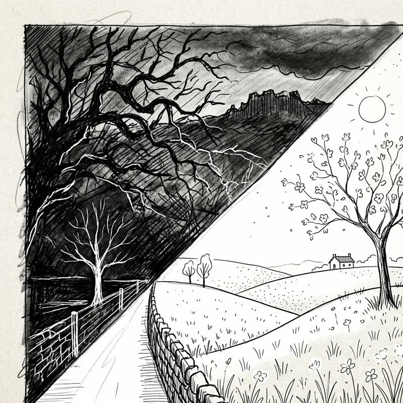
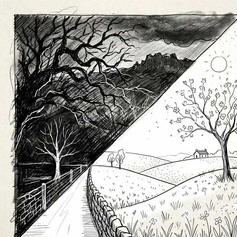
10. Static and Dynamic Composition
Create drawings contrasting stable, grounded elements with energetic, moving forms that suggest motion and tension within frozen images. Static elements feature horizontal and vertical orientations that feel balanced and calm, while dynamic elements use diagonals, curves, and implied movement vectors that energize compositions significantly. Draw a solid building beside wind-blown trees, or a parked car beside running figures for static-dynamic contrasts that create narrative interest inherently. The opposition between stability and motion creates visual tension that uniformly static or dynamic compositions cannot achieve independently. This exercise develops compositional awareness about how orientation, shape, and arrangement communicate energy levels throughout your drawings. Consider how static elements provide rest points that dynamic elements play against, neither overwhelming without the other's balancing presence. Your static-dynamic drawings demonstrate sophisticated compositional thinking that creates engaging visual narratives naturally.
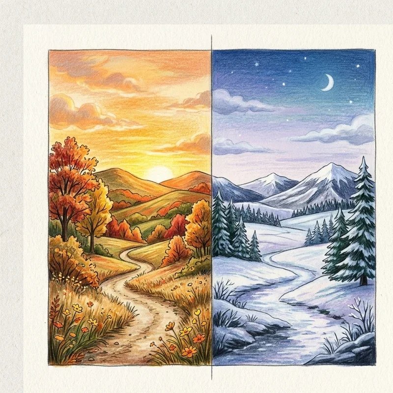
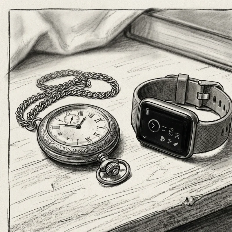
11. Old and New Subject Pairing
Create conceptual contrast by drawing old and new versions of subjects together, exploring how time transforms objects, technologies, and environments visually. Pair vintage automobiles beside modern vehicles, ancient ruins beside contemporary architecture, or antique tools beside their modern equivalents for temporal contrast studies. The visual differences between old and new versions of similar objects reveal design evolution, material changes, and cultural shifts through purely visual comparison. This exercise develops observational skills as you analyze what specifically distinguishes old from new in line quality, wear patterns, and surface characteristics. The conceptual contrast creates automatic narrative interest: viewers wonder about the relationship between old and new elements sharing compositional space. Consider how rendering techniques might differ for weathered antique surfaces versus pristine modern materials throughout your composition. Your old-new contrast drawings combine technical skill with conceptual depth that enriches artistic meaning substantially.
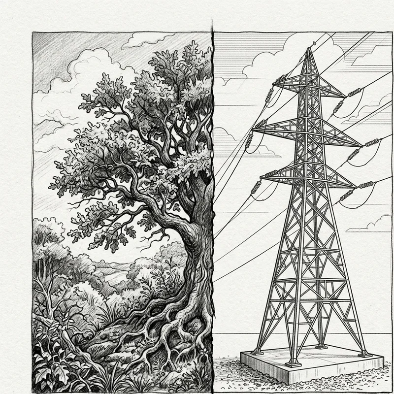
12. Natural and Artificial Elements
Explore the contrast between nature's organic irregularity and humanity's manufactured precision within single compositions thoughtfully designed. Draw plants growing through concrete, wildlife inhabiting urban spaces, or natural materials transformed into human-made objects for nature-artifice contrasts that feel inherently compelling. Natural elements feature infinite variation, irregular edges, and organic growth patterns that contrast sharply against manufactured uniformity and geometric precision. This exercise develops your ability to render both element types convincingly while composing arrangements that maximize their oppositional qualities dramatically. Consider the philosophical implications: these drawings often suggest commentary about humanity's relationship with nature through purely visual means. The technical challenge of switching between organic and geometric rendering within single compositions expands your versatility considerably. Your natural-artificial drawings explore fundamental visual and conceptual oppositions that inform countless artistic decisions.
13. Sharp and Soft Edge Contrast
Develop drawings featuring dramatic edge quality variation where razor-sharp boundaries contrast against soft, lost edges throughout compositions strategically. Edge quality communicates focus, depth, and atmosphere: sharp edges appear closer and more important while soft edges recede and suggest secondary status visually. Draw portraits where eyes feature crisp edges while hair dissolves into soft suggestions, or landscapes where foreground objects maintain sharp focus against hazy distant backgrounds. This exercise teaches selective focus principles borrowed from photography but applicable to all drawing mediums universally. Many artists render every edge equally sharp, creating hyperreal images that lack atmospheric depth and natural focus falloff. The contrast between sharp and soft edges guides viewer attention while creating convincing spatial illusion throughout compositions. Your edge contrast drawings demonstrate sophisticated rendering decisions that distinguish professional work from amateur uniformity immediately.
14. Crowded and Empty Space Balance
Create compositions where visually busy, crowded areas contrast against restful empty spaces that provide essential breathing room for overwhelmed eyes. This contrast creates rhythm: complexity exhausts attention that emptiness refreshes, allowing viewers to appreciate detailed areas without fatigue overwhelming their experience. Draw market scenes with crowded vendor areas beside open pathways, or forests with dense foliage openings into sunlit clearings for crowded-empty contrasts that feel natural. The balance between visual complexity and simplicity requires compositional judgment about how much detail viewers can absorb before needing rest areas. This exercise develops restraint: knowing where to leave space empty proves as important as knowing how to fill areas with engaging detail. Consider how leading lines might guide eyes from crowded areas through empty transitions toward new areas of interest throughout compositions. Your crowded-empty drawings demonstrate compositional sophistication that maintains viewer engagement through strategic density variation.
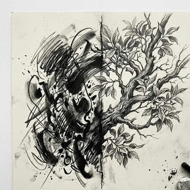
15. Realistic and Abstract Combination
Challenge conventional approaches by combining realistic rendering with abstract elements within unified compositions that celebrate both visual languages simultaneously. Draw photorealistic faces emerging from abstract geometric backgrounds, or recognizable objects dissolving into pure pattern and texture for reality-abstraction contrasts that intrigue viewers. This opposition creates tension between representation and pure visual expression that neither approach achieves alone independently. The exercise develops versatility: switching between controlled realism and expressive abstraction within single drawings expands your technical and conceptual range considerably. Consider where transitions occur: do realistic elements gradually dissolve into abstraction or do hard boundaries separate visual languages abruptly? This approach characterizes much contemporary illustration and fine art where pure representation feels insufficient for communicating complex ideas. Your realistic-abstract drawings demonstrate artistic ambition that transcends traditional category limitations confidently.
Conclusion
Contrast serves as the engine driving visual interest, transforming flat, monotonous artwork into dynamic compositions that demand and reward viewer attention. These fifteen exercises explore contrast across values, textures, scales, details, shapes, edges, and conceptual oppositions that collectively expand your artistic vocabulary substantially. Regular practice with contrast-focused exercises trains your eyes to see relationships rather than isolated elements, shifting how you approach every future drawing fundamentally. Remember that contrast requires intention: randomly applying principles creates chaos, while strategic deployment creates visual music that guides eyes and emotions precisely. Start with value contrast as your foundation, then gradually incorporate other contrast types as your comfort and skill levels increase progressively. Your dedication to understanding and applying contrast principles separates developing artists from those who plateau at intermediate levels indefinitely.
Frequently Asked Questions
Q1: Which contrast type should beginners focus on learning first?
A: Value contrast between light and dark forms the essential foundation for all other types.
Q2: Can too much contrast overwhelm a drawing negatively?
A: Yes, excessive contrast everywhere eliminates hierarchy and exhausts viewers without rest areas.
Q3: How do I identify contrast opportunities in reference photos?
A: Squint to simplify values, then identify where lights meet darks most dramatically throughout.
Q4: Does contrast apply equally to all drawing mediums?
A: Yes, contrast principles apply universally across pencil, charcoal, ink, and digital mediums effectively.
Q5: How often should I practice contrast-focused drawing exercises?
A: Weekly focused practice alongside regular drawing maintains and develops contrast sensitivity continuously.
Stay up to date with our latest ideas!