How to Draw Unity in Art: A Beginner's Guide
Learn how to draw unity in art with simple tips on color, shape, and composition that bring your artwork together beautifully.
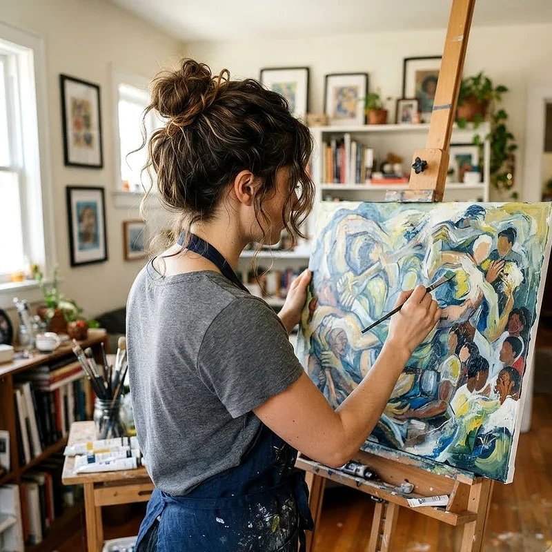
Have you ever looked at a painting and felt like everything just clicked? That feeling, where every element seems to belong right where it is, comes down to one thing: unity. It's the secret sauce that separates a scattered mess of shapes and colors from a piece that truly speaks to people. And here's the good news. You don't need years of art school to figure it out. This guide on How to Draw Unity in Art: A Beginner's Guide is all about showing you the ropes. Whether you're picking up a pencil for the first time or you've been doodling for a while and want to level up, understanding unity can transform your work overnight. So grab your sketchbook, pull up a chair, and let's get into it.
What Exactly Is Unity in Art
Before jumping into techniques, let's nail down what we're talking about. Unity in art is the visual quality that makes all the parts of a piece feel connected. Think of it like a good conversation where everyone stays on topic. When a drawing has unity, nothing feels out of place or randomly thrown in.
Now, unity doesn't mean everything has to look the same. That would be boring, right? Instead, it's about creating a sense of harmony where different elements work together toward a shared purpose. You might use similar colors, repeated shapes, or consistent textures to tie things together. The point is that your viewer's eye moves through the piece smoothly, without getting lost or confused along the way.
Some people confuse unity with uniformity, but they're really not the same thing at all. Uniformity is when everything matches perfectly, like a row of identical boxes. Unity, on the other hand, allows for variety and contrast while still keeping the whole composition feeling cohesive. It's more like a well-organized garden where different flowers bloom together in a way that just makes sense.
Why Unity Matters for Beginners
You might be wondering why you should even bother with unity when you're just starting out. Well, here's the deal. Unity is one of those foundational principles that affects everything else in your artwork. Without it, even the most beautifully drawn objects can look disjointed when placed together on a page.
For beginners especially, learning to create unity early on builds good habits. It trains your eye to see relationships between elements rather than treating each part of your drawing as a standalone piece. Think of it this way: you wouldn't bake a cake by tossing random ingredients into a bowl without thinking about how they work together. Drawing is the same deal.
On top of that, unity makes your art more enjoyable for people to look at. When viewers see a piece with strong unity, their eyes travel naturally through the composition. They feel a sense of calm and satisfaction, even if they can't put their finger on exactly why. That emotional response is what turns a decent drawing into something memorable.
Another reason it matters is that unity gives you a framework for making decisions. When you're staring at a half-finished drawing and wondering what to add next, asking yourself "does this support the unity of the piece?" can point you in the right direction every single time.
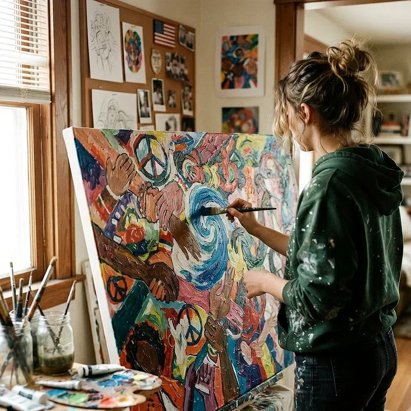
How to Draw Unity in Art A Beginner's Guide to Core Techniques
Alright, now we're getting to the good stuff. Let's walk through some practical techniques you can start using today to bring unity into your drawings.
Using Repetition to Create Connections
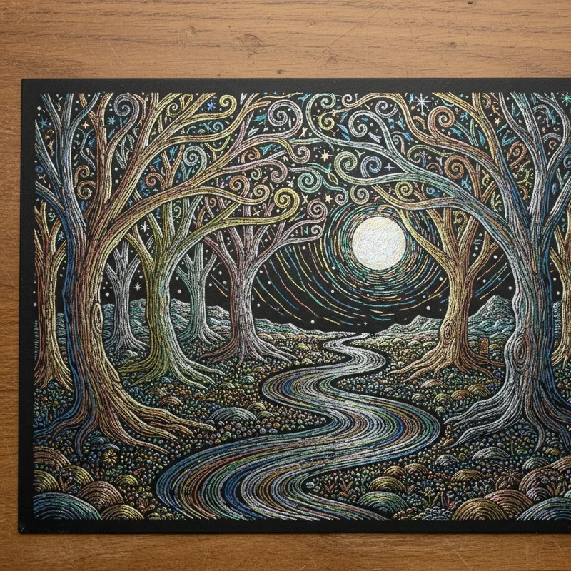
Repetition is probably the easiest way to build unity, and it works like a charm. When you repeat certain elements throughout your drawing, like a particular shape, line style, or pattern, it creates visual echoes that tie the whole piece together.
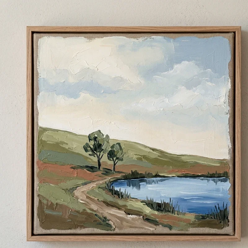
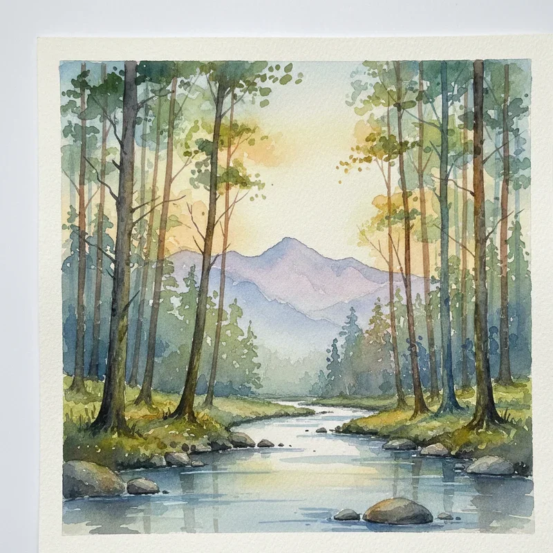
For example, imagine you're drawing a landscape. If you use rounded, organic shapes for the trees, try carrying that same roundness into the clouds, the hills, and even the rocks in the foreground. Your viewer might not consciously notice the repetition, but their brain picks up on it and registers the drawing as unified and complete.
You don't have to go overboard, though. Repeating one or two elements is usually enough to do the trick. Too much repetition and your drawing starts to feel monotonous, which is the opposite of what we're going for.
Building Unity Through Color Harmony
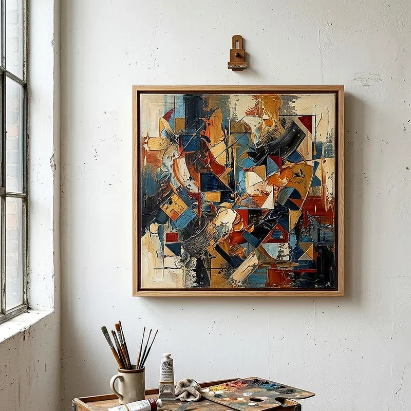
Color is another powerful tool for creating unity, and it's one that beginners often overlook. When the colors in your drawing share a common thread, whether that's a similar hue, temperature, or saturation level, the whole piece feels more pulled together.
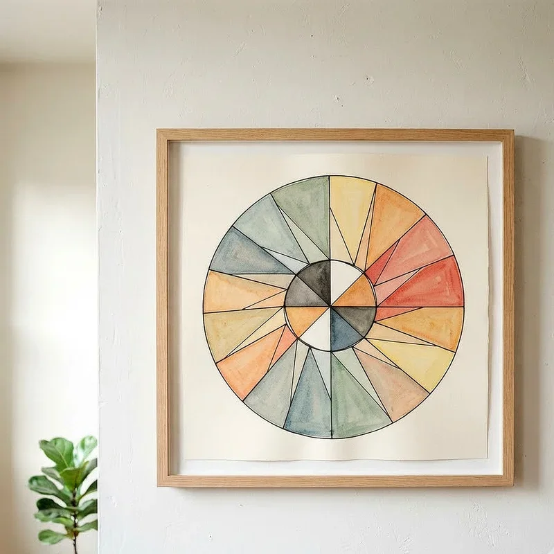
A simple approach is to pick a limited color palette before you start drawing. Three to five colors that relate to each other is a great starting point. You can use analogous colors, which sit next to each other on the color wheel, or go with a complementary scheme where two opposite colors create a dynamic but still unified look.
Here's a little trick that works wonders. Mix a tiny bit of one color into all of your other colors. This creates what artists call a "mother color," and it subtly connects every hue in your palette. Even if your drawing uses a wide range of tones, that underlying thread of shared color brings everything into alignment.
Consistency in Style and Mark Making
Ever seen a drawing where one part looks super realistic and another part looks like a cartoon? It can be jarring, and that's because the inconsistent style breaks the unity. Keeping your mark-making consistent across the entire drawing is a straightforward way to maintain that cohesive feel.
This doesn't mean every stroke has to be identical. What it means is that your overall approach stays the same throughout. If you're using loose, gestural lines in one area, carry that same energy into the rest of the piece. If you're working with tight, precise cross-hatching, don't suddenly switch to broad, sweeping strokes halfway through.
Think of your drawing style as the "voice" of the artwork. Just like a writer keeps a consistent tone throughout a story, you want your visual voice to stay recognizable from corner to corner.
Common Principles That Support Unity
Beyond the specific techniques above, there are some broader principles of design that naturally support unity in your drawings. Understanding these gives you a more complete toolkit to work with.
Proximity and Grouping
Elements that are placed close together tend to feel related. This is a basic principle of visual perception, and you can use it deliberately in your compositions. By grouping related objects together and leaving space between different groups, you create clear visual relationships that strengthen unity.
For instance, in a still life drawing, you might cluster the fruits together on one side and place the vase slightly apart. The grouping tells your viewer's eye that those fruits belong together as a unit, while the vase plays a different but connected role in the composition.
Alignment and Flow
When elements in your drawing share common edges or follow a visual path, they feel more connected. Alignment creates invisible lines that guide the viewer's eye through the piece. This sense of movement and direction is a key part of what makes a drawing feel unified rather than scattered.
Try this exercise: before you start drawing, sketch out a simple directional flow for your composition. It could be a gentle curve, a diagonal line, or even a circular path. Then, as you add elements to your drawing, position them so they follow or relate to that underlying flow. The result is a piece where everything feels intentionally placed.
Visual Weight and Balance
Unity also depends on how visual weight is distributed across your drawing. If all the heavy, dark, or complex elements are bunched up in one corner while the rest of the page sits empty, the piece feels lopsided and disconnected.
Balancing visual weight doesn't mean making everything symmetrical. Asymmetrical balance, where a large simple shape on one side is balanced by a small detailed area on the other, can feel just as unified. The key is that no single area overwhelms the rest to the point where the composition falls apart.
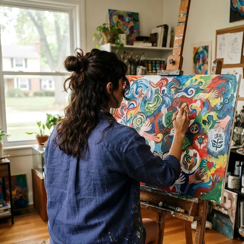
Step by Step Practice Exercise for Beginners
Let's put all of this into practice with a simple exercise you can try right now.
1. Start by choosing a simple theme for your drawing, like "ocean" or "garden." This theme acts as your conceptual thread.
2. Select three to four shapes that relate to your theme. For an ocean theme, you might choose circles for bubbles, wavy lines for water, and triangles for fish fins.
3. Pick a limited color palette of three colors that feel connected. For the ocean, maybe different shades of blue and a soft green.
4. Sketch a rough composition on your page, using a simple directional flow like a gentle S-curve to guide where your elements will go.
5. Begin filling in your composition, repeating your chosen shapes at different sizes and positions along your flow line.
6. As you work, keep checking that your mark-making style stays consistent throughout the piece.
7. Step back and squint at your drawing. Squinting blurs the details and lets you see the overall unity of the piece more clearly.
This exercise might feel basic, and honestly, it is. But that's the point. Starting simple lets you focus on the principle itself without getting bogged down by complicated subject matter. Once you've got the hang of it, you can apply these same ideas to more complex drawings.
Mistakes That Break Unity and How to Avoid Them
Even with the best intentions, it's easy to accidentally undermine the unity of your drawing. Here are some common pitfalls and how to sidestep them.
Using too many competing focal points is a big one. When your drawing has three or four areas all screaming for attention at the same volume, the viewer doesn't know where to look. Instead, choose one primary focal point and let everything else play a supporting role.
Switching materials or techniques midway through a drawing can also cause problems. If you start with graphite and then decide to throw in some colored pencil and maybe a bit of ink, the different media can clash unless you're really intentional about blending them together.
Ignoring the background is another trap beginners fall into. You might spend hours perfecting the main subject of your drawing but leave the background as an afterthought. The background is part of the composition too, and it needs to relate to the rest of the piece in terms of color, texture, and energy.
Finally, overcomplicating things is a surefire way to kill unity. When in doubt, simplify. Pull back on the number of elements, reduce your color palette, or streamline your composition. Less really can be more when it comes to creating a unified piece of art.
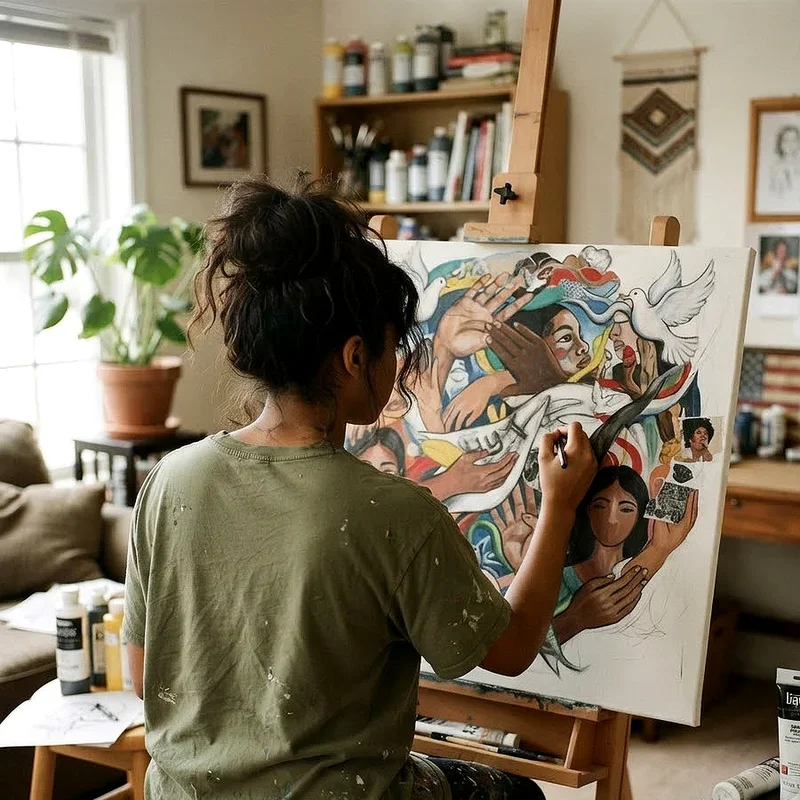
How to Draw Unity in Art A Beginner's Guide to Growing Your Skills
Once you've got the basics down, the real fun begins. Growing your understanding of unity means exposing yourself to lots of different art and paying attention to how successful pieces hold together.
Visit museums and galleries, or even just scroll through art communities online, and ask yourself what makes each piece feel unified. Look for the repetition, the color relationships, the consistent style. Over time, this kind of active observation sharpens your instincts and makes unity second nature in your own work.
Another great way to grow is by setting yourself constraints. Try creating a drawing using only two colors, or limit yourself to one type of line. Constraints force you to find creative solutions within a narrow framework, and that naturally leads to stronger unity.
Don't be afraid to experiment and mess up, either. Some of the most interesting art comes from breaking rules, but you need to understand the rules first before you can break them effectively. Unity is one of those rules that, once internalized, gives you the freedom to push boundaries while still keeping your work grounded and intentional.
Practice regularly, seek feedback from other artists, and keep pushing yourself outside your comfort zone. The journey of learning how to draw with unity is ongoing, and every drawing you complete teaches you something new about how elements interact on a page.
Conclusion
Mastering unity in art is less about strict rules and more about developing an eye for how things connect. By focusing on repetition, color harmony, consistent style, and thoughtful composition, you can transform even the simplest drawings into cohesive pieces that resonate with viewers. Keep practicing, stay curious, and remember that every great artist started exactly where you are now. The principles in this guide will serve you well for years to come.
Read next: 15 Art Drawing Ideas to Spark Creativity
Frequently Asked Questions
Q1. What is the simplest way to create unity in a drawing?
A: Repeating a single shape or color throughout your composition ties everything together quickly.
Q2. Can you have too much unity in artwork?
A: Yes, excessive unity creates monotony, so balance it with some variety and contrast.
Q3. Does unity mean everything in a drawing must match?
A: No, unity means elements relate to each other, not that they look identical.
Q4. How does color help with unity in art?
A: Using a limited, harmonious color palette connects different elements across your entire composition naturally.
Q5. Why do beginners struggle with unity in their drawings?
A: Beginners often focus on individual elements without considering how they relate within the composition.
Stay up to date with our latest ideas!