What Are Neutral Colors in Art? A Beginner's Guide
Discover what neutral colors in art really mean, why artists love them, and how beginners can use them to create stunning artwork.
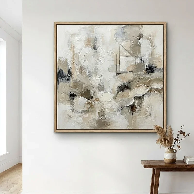
Ever looked at a painting and felt instantly calm without knowing why? Chances are, neutral colors were doing all the heavy lifting. They're the unsung heroes of every color palette, quietly pulling everything together while the brighter shades steal the spotlight. If you've been wondering what all the fuss is about, you're in the right place. This guide on What Are Neutral Colors in Art? A Beginner's Guide breaks it all down in plain language. Whether you're just picking up a paintbrush for the first time or you've been dabbling in sketches for a while, understanding neutrals is going to change how you see every piece of art. So, let's jump right in.
Why Neutral Colors Matter More Than You Think
Here's the thing most beginners overlook. Neutral colors aren't boring. They're the backbone of nearly every great composition you've ever admired. Without them, bold colors would clash like strangers at a dinner party. Neutrals create breathing room. They give your eyes a place to rest when a canvas is packed with visual information.
Think of it this way. If every instrument in an orchestra played at full volume all the time, you'd lose the melody. Neutral colors are like the quiet instruments that support the soloist, making sure the whole piece sounds harmonious. Artists from the Renaissance to modern abstract painters have leaned on neutrals to create depth, mood, and a sense of balance that just feels right. So next time someone calls beige or gray "plain," you'll know better. Those colors are carrying far more weight than anyone gives them credit for.
Defining the Neutral Color Family
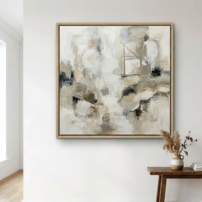
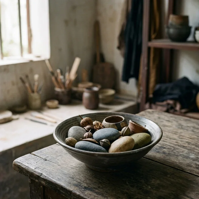
So what exactly falls under the neutral umbrella? At its core, the neutral color family includes black, white, gray, brown, and beige. Some artists also toss in muted tones like taupe, ivory, and cream. These colors don't appear on the traditional color wheel, which is part of what makes them unique. They sit outside the usual conversation about primary and secondary hues, playing a supporting role that's absolutely essential.
Now, here's where it gets interesting. Neutrals aren't always "pure." A warm gray might lean toward brown, while a cool gray could carry a hint of blue. These subtle shifts in temperature make neutral colors far more versatile than they seem at first glance. An experienced painter can mix dozens of distinct neutrals just by adjusting the ratios of warm and cool pigments. For beginners, recognizing this range is a real game changer. You start to see that "gray" isn't just one flat color. It's an entire spectrum hiding in plain sight.
The Science Behind Neutral Tones
Let's get a little nerdy for a moment, shall we? From a color theory standpoint, neutral colors are created when complementary colors on the color wheel are mixed together. Red and green, blue and orange, yellow and purple. Combine any of these pairs, and you'll end up somewhere in neutral territory. Add white to lighten or black to darken, and you've got an endless range of muted tones to work with.
This isn't just a classroom exercise, either. Understanding how neutrals form helps you mix them from scratch without relying on tubes of pre-made paint. It gives you more control over your palette and, honestly, it saves you money in the long run. Why buy ten shades of gray when you can mix exactly the one you need from colors you already own? That kind of practical knowledge is what separates someone who paints from someone who truly understands painting.

Warm Neutrals vs. Cool Neutrals
Not all neutrals are created equal, and this is a concept that trips up a lot of newcomers. Warm neutrals carry undertones of red, yellow, or orange. Think of sandy beige, caramel brown, or a creamy off-white. These tones evoke feelings of comfort, warmth, and earthiness. They tend to advance visually, meaning they appear to come toward you on the canvas.
Cool neutrals, on the other hand, lean toward blue, green, or violet undertones. Slate gray, charcoal, and dusty lavender-gray all fall into this category. They recede visually, creating a sense of distance and calm. When you place warm and cool neutrals next to each other in a painting, something magical happens. You create a subtle push and pull that adds depth without relying on saturated colors. It's one of those tricks that professional artists use all the time, and it's surprisingly easy once you know what to look for.
How Artists Use Neutral Colors in Composition
Neutral colors play several roles in a composition, and a skilled artist might use all of them in a single piece. Here are some of the most common approaches:
Creating a ground or underpainting. Many painters start with a neutral-toned surface before adding brighter colors on top. A warm ochre ground gives the entire painting a cohesive glow, while a cool gray ground can make colors appear more vivid.
Building transitions between bold colors. Neutrals act as bridges, softening the shift from one vivid hue to another so the eye moves smoothly across the canvas.
Establishing mood and atmosphere. A foggy landscape leaning heavily on grays and muted blues creates a very different emotional response than a scene dominated by bright primaries.
Drawing attention to focal points. By surrounding a vibrant element with neutral tones, artists naturally guide the viewer's eye to exactly where they want it to land.
Adding realism to shadows and highlights. Shadows in real life are rarely pure black, and highlights are rarely pure white. Mixing neutrals into these areas makes them look far more believable.
Understanding these techniques is a core part of What Are Neutral Colors in Art? A Beginner's Guide, and once you start noticing them, you'll see these strategies everywhere.
Famous Artworks That Celebrate Neutral Palettes
You don't have to look far to find masterpieces that lean heavily on neutral palettes. Whistler's arrangement paintings, often nicknamed portraits, used an extraordinary range of grays and soft browns to create moody, atmospheric compositions. His famous painting of his mother is practically a lesson in how powerful a limited neutral palette can be.
Andrew Wyeth is another artist who built his entire reputation on earthy, muted tones. His tempera paintings of rural landscapes and weathered buildings use browns, tans, and soft grays to evoke a sense of quiet nostalgia that's hard to shake. Then there's Giorgio Morandi, the Italian master of still life, whose bottle paintings feature an almost impossibly subtle range of dusty pinks, soft grays, and faded creams. These artists prove that you don't need a rainbow to make someone stop and stare.
Getting Started With Neutrals in Your Own Work
Alright, enough theory. Let's talk about how you can start putting neutrals to work in your own art. First, grab whatever paints you already have and try mixing some complementary pairs. Take a small amount of red and mix it with green. You'll see a brownish tone emerge. Add a touch of white, and suddenly you've got a warm, muted neutral you can use anywhere.
Next, try creating a value scale using just black and white. Paint a strip that goes from pure white on one end to pure black on the other, with five to seven gradual steps in between. This exercise trains your eye to see subtle differences in lightness and darkness, which is essential when working with neutrals. It's one of those boring sounding exercises that actually transforms how you approach every painting after you do it.
Once you're comfortable mixing neutrals, try painting a simple still life using nothing but neutral tones. Pick a few objects, set up a lamp, and paint only what you see in terms of light and shadow. You'll be amazed at how much life and dimension you can create without touching a single bright color. Many art teachers assign this exercise early on because it forces students to focus on value and form rather than getting distracted by hue.

Common Mistakes Beginners Make With Neutrals
Let's be real for a second. There are some pitfalls that nearly every beginner falls into when working with neutral colors for the first time. Being aware of them upfront can save you a lot of frustration.
One of the biggest mistakes is treating all grays as the same. Grabbing a tube of pre-mixed gray and slapping it everywhere results in a flat, lifeless painting. Instead, vary your grays by leaning some toward warm and others toward cool. This creates visual interest even in areas that might seem unimportant.
Another common error is using pure black for shadows. Straight-from-the-tube black tends to deaden a painting because it lacks the warmth or coolness that real shadows carry. Try mixing a dark neutral from complementary colors instead. You'll get a much richer, more natural-looking dark that integrates better with the rest of your palette.
Finally, some beginners avoid neutrals altogether, thinking they'll make the work look dull. That's like refusing to use silence in music. Without those quiet moments, the loud parts lose their impact. Neutrals are the quiet moments that make your bold colors sing.
Neutral Colors in Different Art Mediums
Neutrals behave a little differently depending on the medium you're working in, and it's worth knowing these differences before you dive into a project.
In oil painting, neutrals mix beautifully and stay stable as they dry. You can layer warm and cool neutrals over each other to build incredible depth. Oils also allow for smooth blending, which makes transitions between neutral tones almost effortless.
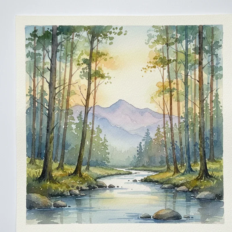
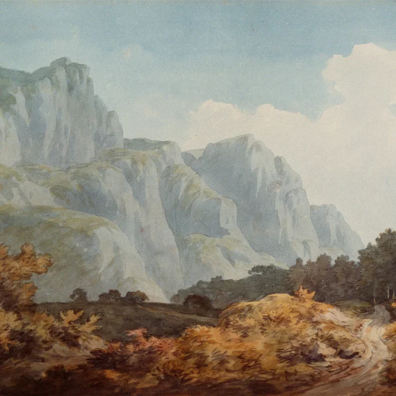
With watercolor, neutrals tend to feel lighter and more transparent. You can create lovely neutral washes by mixing complementary colors in very dilute form. However, overworking a watercolor neutral can turn it muddy fast, so restraint is key. Less is genuinely more in this medium.
Acrylic paints dry darker than they appear when wet, which is something to keep in mind when mixing neutrals. What looks like a perfect light gray on your palette might dry down to a medium tone on the canvas. Testing your mixes on a scrap surface before committing is a habit worth building.
For digital artists, neutrals offer the advantage of perfect consistency. You can sample a neutral tone and replicate it precisely across an entire composition. The challenge in digital work is more about choosing the right neutral than mixing it, since you've got millions of options at your fingertips.
Building a Neutral Color Palette for Your Studio
If you're stocking your studio and wondering which neutrals to start with, here's a practical approach. You don't need to buy every shade of gray and brown on the shelf. Instead, pick up a few versatile colors and learn to mix the rest.
A solid starting kit would include titanium white, ivory black, raw umber, burnt sienna, and yellow ochre. With just these five colors, you can mix an incredible variety of warm and cool neutrals. Raw umber leans toward cool browns, burnt sienna provides warm reddish-browns, and yellow ochre adds a golden warmth that's perfect for skin tones and sunlit scenes.
As you advance, you might add Naples yellow, Payne's gray, and raw sienna to your collection. These pigments extend your neutral range without cluttering your palette. The goal isn't to own every color. It's to know your colors so well that you can mix whatever you need from a handful of trusted tubes.
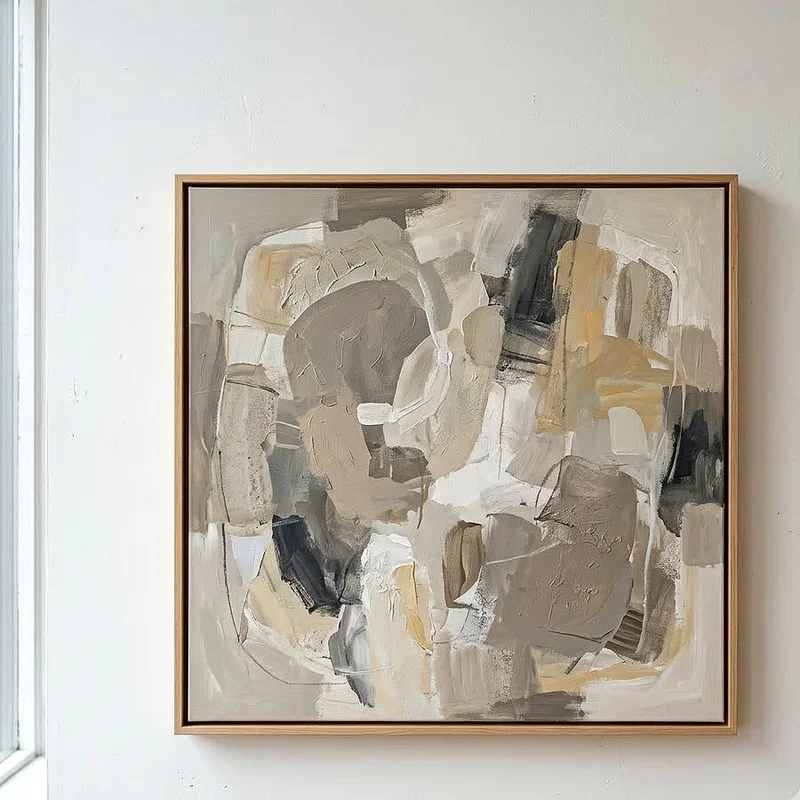
What Are Neutral Colors in Art? A Beginner's Guide to Seeing Differently
Here's the real takeaway from this entire discussion. Learning about neutral colors doesn't just change how you paint. It changes how you see the world around you. Once you understand neutrals, you start noticing the subtle gray in a cloudy sky, the warm brown in a wooden table, the cool beige of a concrete wall. Every surface becomes a study in neutral tones.
This shift in perception is what separates casual hobbyists from artists who genuinely understand their craft. It's not about memorizing color charts or following rules. It's about developing an eye that can pick apart any scene into its component colors, including the quiet neutrals that hold everything together. That's the heart of What Are Neutral Colors in Art? A Beginner's Guide, and it's a lesson that will serve you for as long as you choose to create.
Conclusion
Neutral colors might not grab headlines or win flashy awards, but they're absolutely essential to great art. From creating depth and balance to setting mood and guiding the viewer's eye, these quiet tones do more work than most people realize. Whether you're painting on canvas, working digitally, or just learning to mix your first palette, embracing neutrals is one of the smartest moves you can make. So go ahead, give those grays, browns, and beiges the attention they deserve. Your artwork will thank you for it.
Read next: 15 Neon Painting Ideas to Brighten Your Artwork
Frequently Asked Questions
Q1. What are the main neutral colors used in art?
A: The main neutral colors include black, white, gray, brown, beige, taupe, ivory, and cream tones.
Q2. Can you mix neutral colors from other paint colors?
A: Yes, mixing complementary colors together and adding white or black creates a wide neutral range.
Q3. Are neutral colors warm or cool in temperature?
A: Neutrals can be either warm or cool depending on their underlying red, blue, or yellow undertones.
Q4. Why do artists use neutral colors in paintings?
A: Artists use neutrals to create depth, balance compositions, set mood, and highlight focal points effectively.
Q5. Do digital artists need to understand neutral colors too?
A: Absolutely, digital artists rely on neutrals for realistic shading, balanced compositions, and professional-looking visual work.
Stay up to date with our latest ideas!